
(Photo credit: Albert Kok, Wikimedia)
Yet photo-based picture books are a long tradition, going almost back to the beginning of both. And we cannot all dive to the bottom of the seas to take our own pictures of sharks… nor is there any need to, with good-quality stock photos and (high-quality! read my post!) internet photos.
So I decided to search through Amazon to find out exactly what’s out there these days: the good, bad, and ugly in kids’ picture books that are based around photos. But not in that order!
Books illustrated with photos tend to come from the non-fiction end of the spectrum… but not entirely, as we’ll see in a couple of the examples below. They can be found both in slick professionally-published versions and some good, bad and loathsome self-pubbed editions.
Let’s take a look, and hopefully get inspired to create great ones ourselves.
The Good (professional and self-published)
Just about anything from a mainstream, professional publishing company is guaranteed to be beautiful.
Here’s a whole series from Scholastic / National Geographic, a company made famous by its images, even for adults.
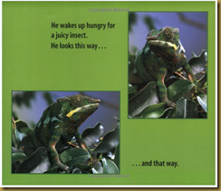
In these professional picture books, the text is often superimposed on the photos, which gives it a high-quality professional look…
But you don’t have to do that to get a great look.
Here’s another book that’s absolutely beautiful, but doesn’t superimpose text on the pictures (okay, except on the cover!).
Plus – bonus! The pictures serve the text, and not the other way around.
But don’t worry if you’re thinking of self-publishing!
Self-published books in this area can also be quite good. Some are hampered by awkward Kindle formatting, but nevertheless manage to present a great combination of words and text:
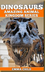
(What kid wouldn’t LOVE that cover??? I know my bloodthirsty 6-year-old would!)
This writer has more books in her series, and I’m confident that each one is packed with if not the most original content, at least well-edited, clearly readable text. Or maybe I’m just a sucker for a nice, consistent cover design. But in the world of self-publishing, a good cover design goes a LOOooong way.
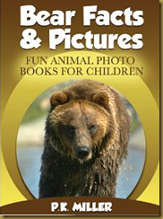
Here’s another self-published book (illustrated, in part, with Wikimedia images, according to the writer’s copyright information!) that does a good job, in my opinion (again, hampered a bit by the Kindle format).
So the (reasonably) good news is that you don’t have to be a pro to create a good animal book (though you may have to hire one to get a look that doesn’t scream “amateur!”)
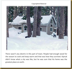
The main advantage of an all-digital format, like Kindle, is that you don’t have to worry as much about page design and layout. The disadvantage is that you don’t get as professional-looking a layout for your book.
In self-published paperbacks, I found a few promising stories that were created with photos. In this book, the photos are turned into charming “paintings” with the help of a quick Photoshop effect. Warning: I don’t like the cover.
I the full-bleed image on the cover somewhat belies the lovely photos I saw inside. Overall, I think the inside of this book is far more subtle and interesting than the outside. The text looks decent, too, though I might have fiddled with the font a bit.
(Any good photo-editing program can create this “painting” effect, by the way, turning your photos into an oil painting in an instant. I just did one quickly to play around with this site and ended up with this “painting” of the little shark shown at the top of this post:)
Finally, for sheer cuteness and the realm of possibilities it opens up (and its intriguing mixture of “truth” and “fiction”), I love seeing cartoons and text superimposed on photos, as in this self-published book:
I haven’t read it, and don’t know if this is a good book or a bad book… but I know it made me smile (in a GOOD way!), and that’s really something.
The Ugly
Here’s where my bias comes out. Yeah, that bias about the #1 Mistake in children’s-book writing: shoving in values where they don’t really belong. And shoving fun right on out the other side.
Yes, this makes me cranky.
Photo books for kids that fall into the “explore a different world” category sometimes a little too mired in social values to be interesting. Some of them just sort of plod along and don’t manage to capture a lot of beauty and fun along the way.
Books in this category tend to present the “foreign culture” motif, like this one, called Healthy Kids.
The cover is very promising! It shows an “ethnic”-looking child having fun in a sort-of “exotic” location. But the book very quickly descends into drab.
I’m not saying there’s anything wrong with this book. But the text is far less than lively. In my opinion, this book suffers from putting the photos first… as in, “let’s collect a bunch of okay photos around the world, and then talk about them a little.”
And the title? What kid wants to read about HEALTHY???
This book does slightly better, with an ABC of pictures from Ethiopia:
(We lived with many Ethiopians after we moved to Israel, and I love this shoulder dance!)
Fine. I admit to reading books like these to my kids on occasion. But unless they show true, dire poverty or perhaps limblessness, my own bloodthirsty, drama-hungry kids aren’t generally interested.
These are both professionally-produced and published books, but there are plenty of ugly self-pubbed books as well, particularly in this category. But enough of this; I feel a “kvetch” (ie complaint) coming on and I’m ready to move on to…
And the truly BAD…
Know what else makes me cranky???
Okay, you know me. You know I normally don’t knock other writers’ self-published work (cuz then they could turn around and knock mine!).
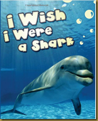
But in this case… I just had to. I came across this guy’s animal book on Amazon, and discovered it’s part of a whole series of “wish I were” books with almost exactly the same words in each.
The cover is moderately appealing… until you flip it over. There, you meet the writer, who attempts to describe his own book.
Sound intriguing? Then perhaps you might also like these other books, from the same writer!
Meet an elephant who wants to be a Squirrel. This is Taylor. Taylor is an elephant. He is 7 years old, some people would call her a small elephant.
But Taylor doesn't want to be a elephant . He would prefer to be a SQUIRREL.
He wants to have all the advantages that SQUIRRELS have. So, let’s join him on his dream.
Sound familiar???
Meet a Cat who wants to be a Dinosaur. This is Marry. Marry is a Cat. She is 4 years old, some people would call her a small Cat. But Marry doesn't want to be a Cat. She would prefer to be a DINOSAUR. She wants to have all the advantages that DINOSAURS have. So, let’s join her on her dream.
At least this writer has the smarts to change “her” to “him.” There are others in the series, like a giraffe who wants to be… well, something else.
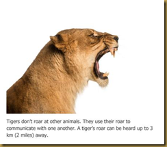
Here’s a page from this writer’s book about tigers:
Check out this site for more amazing tiger facts… probably one of a few from which the writer copy/pasted his facts.
This writer has illustrated all his books with stock photos – not an inherently bad thing to do, but as I said in my last post, you’ve got to write the book first, then choose images to suit your story – not the other way around.
Want to see his book of stock-photo close-ups of cows?
(Yes, the cow is sniffing the grass and musing, “It’s has a strange smell.” Give her a break; where would a cow learn grammar, anyway???)
What about a book about animals that ROAR? I like the concept, actually… but something about his description is less than thrilling.
Does all animals roar ? Well, no they don’t [shouldn’t that be “doesn’t”?]. The animals that roar are : Alligators, bears, elephants, hippopotamuses , lions and tigers. Come and join us on a roaring amazing experience.
He’s also “written” one about ponies:
This is a great book about ponies. What are the ponies, where can we find them and more amazing facts. [What? In a field? Amazing!]
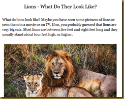
One question on every child’s mind who has been raised inside a cardboard box has got to be: what the HECK do lions look like, anyway???
He goes on to say (fascinating lion trivia!), “they are the only cats that actually has a tuft at the very end of the tail.”
Enough. I’ll lay off. But it annoys me to no end when people “publish” “books” like these and clutter up the world… but at least they’re mainly ebooks, so they just clutter up hard drives and ereaders, not the actual world.
Ah, but what would a post with so much kvetching (aka complaining) be without wrapping up with a final PET PEEVE… so here you go.
Final Pet Peeve:
I suspect this also irritates others, everyday, all over Amazon.com. You know how they say, “don’t judge a book by its cover”? Well, why the heck shouldn’t we? It’s your job, as the writer, to ensure that your book lives up to the promise of its cover. Not just picking a cover because it’s nice, regardless of whether or not it matches the actual book.
Like this one. “Hmm,” muses the unsuspecting blogger. “Decent-looking cover for a self-pubbed kids’ book…” (no, it’s not porn inside; don’t worry, this is a family-friendly site!)
I clicked on this one eagerly, interested in learning a thing or two about Kentucky… only to find…
Waaah! Go away, blocky computer-drawn horse – I want LANDSCAPES!!!
Do you have any pet peeves when it comes to children’s book illustrations? Have you written a book and used photos for the illustrations? Share a link to it here!














Often the cover, both front and back, sell a Kids book. If you watch people in stores, they pick up the book because of the cover, then flip to the back cover and then flip through the pages, looking mainly at the illustrations. Rarely do they read the text. Beryl
ReplyDelete@Beryl, I guess I'm the exception, then! I always read the first couple of paragraphs to make sure I can get into a book. And I never buy a kids' book, or take it out of the library, without screening the text thoroughly as well. I guess that's why I'm so picky about the reviews I accept. Thank you for stopping by!
DeleteI have to agre with Beryl.
ReplyDeleteA book IS most often judged by its cover. I even recall buying record albums in the 70s – often choosing the ones with the coolest covers.
One of my favourite books in the late-90s was actually an entire volume of cool album covers, many from the 1970s. I agree that the cover is a huge deal... but, see above, some of us DO check out the interior as well. :-)
DeleteOops... meant mid-80s, not late-90s. Though I'm sure many such art volumes have been put together over the years.
Delete