Showing posts with label graphics. Show all posts

Sunday, February 5, 2017

From Manuscript to Self-Published Book in 10 Simple Steps

image

What’s next? 

That’s the question I hear most often from writers out there.  Maybe even from you.  It’s what everybody wants to know, so if you’re stuck on that question, you’re not alone.

You already have a great story, one you really believe in, and you’re READY – you just want to get your story out there into the world.

Here’s the great news:  you CAN!

You can self-publish your book, in ten not-so-tough steps I’ll lay out for you here.  You’ll have to put in some time, some energy, and there is absolutely a learning curve.  But I believe this process is so simple that just about anybody can master it with a little experience.

I’m going to illustrate these steps with a book that I actually did self-publish.  It’s called Shabbat Monsters.  It’s a good example because it’s a pretty classic 32-page rhyming picture book. 

Let’s get started… at the very beginning, with

Step 1.  Your MANUSCRIPT.

image

Looks pretty plain, doesn’t it?  I hope you’ve had it professionally edited.  If not, go do it – NOW.

Okay, you’re back.  Your story’s ready.  Let’s move on to…

Step 2. Your dummy

No, I’m not CALLING you a dummy!  It’s time to make a dummy.  32 pages, 2-page spreads.  Time to start planning what we (the reader) are going to see on every single page.

imageimageimage

So that’s the first stage of planning what the pages are going to look like.  Once I know what illustrations I’m going to need, it’s time for…

Step 3.  Artwork

If you’re not an artist (you’ll know if you are), I strongly recommend you get a professional to do this step, even if you have to pay them.  I loved the artist I worked with for this book.  A little slow, but she was very responsive.  First, she sent me sketches…

image

Wednesday, July 8, 2015

Beyond Comic Sans: 11 free fonts handpicked for children's book interiors

image

Have you fallen into the Comic Sans trap?

Comic Sans was considered a great font when it was first released in 1994.  But over the years, it’s gotten tired.  These days, many indie authors use and recommend it as a good font for kids’ books, because it’s clear and easy to read.  But it will brand you as an amateur more quickly than almost anything else.

I’m sure you recognize this – right?

image

Here are some great choices of alternative fonts you can use – and they’re all free, so there’s no excuse.

Monday, March 2, 2015

Is your kids’ book blah or blechhhh? These 10 FREE font pairings add a professional touch.

image

Picture a mom, surfing Amazon one morning.  Maybe she’ll buy your picture book?  It’s perfect for her kids.  The cover sure looks promising, she thinks.  She clicks on it to Look Inside.  She skips through a couple of pages, and suddenly, she’s shaking her head. 

Something’s clued her in.  She’s figured out that your book is self-published and she suddenly has no desire to read any further.

What went wrong???

Readers don’t usually know exactly what’s turned them off about a self-published book.  But a lot of the time, badly-chosen fonts are the culprit.  Maybe your fonts are amateurish?  Maybe you’re using cruddy novelty fonts that make your book hard to read or dizzying on the page?

Today, there are so many great great FREE font choices out there.  Your book doesn’t have to be the one she clicks shut.  It could be the one she clicks Buy for instead and eagerly waits for it to show up in her mailbox so she can share it with her kids.

You may not be a professional graphic designer, but you should have some understanding of the basics of what makes a good font combination.  The fonts of your book should be:

  • clear
  • readable (for adults and kids)
  • normal, ie not attract TOO much attention

I’m sure you’ve seen children’s stories that look like this.  The text is muddled and hard to read:

image

So how can you rescue your book from falling into the same trap?

Ten free font combos to the rescue!

These 10 winning font combos are superheroes of the modern design world.  They’ll help you perk up any kids’ book and create just the right mood for your story.  These 20 fonts are all free, so there's no excuse to stick with Calibri, Times New Roman, Papyrus or (gasp!) Comic Sans anymore.

Thursday, December 18, 2014

Drat, foiled again (or the spineless truth about CreateSpace).

image

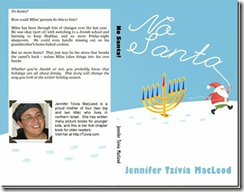
I told you a couple of weeks ago all triumphantly how I created a kissable cover and got around Amazon / Createspace’s arbitrary minimum-page requirements for having a proper spine on your book.  I succeeded that time with my 100-page chapter book No Santa!  image

But guess what???  When I tried the same magic again yesterday with an 88-page nonfiction book, Createspace stopped me in my tracks with their silly arbitrariness.

I worked long and hard to create a BEAUTIFUL (if I say so myself) cover, and submitted it along with my interior.  Here’s what the full design looks like:

image

(Spineless Wonders is the first in what I plan as a series of Jewish, Bible-based science books that’s already available for Kindle here.)

Believe me, everything fit perfectly within the little template they give you. 

image

But when I submitted all the files, Createspace’s gnomes went to work destroying all that is good.  They must have detected that I was trying to get away with something.  When my files were approved for proofing, I went in to take a peek… only to discover this message:

Monday, September 29, 2014

5 illustrated ways to overcome the “self-published” curse (and make your picture book look great).

image

Are you cursed?

Lots of writers would swear they are.

It’s sort of true.  There’s a “self-published” curse that makes many, many independent, print-on-demand and Kindle books look… bad.  Stinky.  Rotten.

Is yours one of them?

I don’t believe in curses, I believe in bootstraps.  I hope you do, too.

I believe that today every writer has a chance to succeed in publishing a kids’ book… by following these five tips (illustrated for your amusement) to help ensure that yours succeed.

Before you go on, here’s my confession:  I have made mistakes in all of the following areas.  Might be making them at this very moment.  Who hasn’t? 

That’s how we learn.

Let’s sit down and learn these five easy lessons (with illustrated examples by me!) together.

1.  Fonts – get serious.

There is a special place in purgatory for those who rely on Comic Sans to make their story seem childlike / innocent / fun.  Your book is made for reading… so make it readable. 

Script fonts can be hard to read, especially in large doses where there’s not enough whitespace around them.  Similarly, novelty fonts like this sawed-off-boards font make it difficult to read more than a little text at a time.  Finally, don’t mix more than three into your book.  I think the experts say four, per page… but I say three per book, so there.

image image

Sunday, August 31, 2014

Three FREE graphics programs writers need in their arsenal.

image

Need a quick tweak for an illustration or cover? 

It doesn’t have to be a pain.  I promise, I’ll make this as easy and low-tech as possible.

Ideally, a professional would handle anything image-related, from changes to illustrations to adding text to your covers.  But for small fixes, you’re not stuck with Windows Paint. 

And even if you’re not planning on doing a lot of image manipulation, there are good reasons why you need a reliable paint program to turn to from time to time.

Obviously, you don’t want to spend a ton of money, which is why I’ve gathered this collection of three good, stable choices that you can download and start using absolutely free.

(I don’t get any kind of kickback for suggesting these – they’re just good programs that I have used myself.)

Autodesk Pixlr (Desktop version)

This program is free, fast to load and pretty nifty.  It’s also very bare-bones.  There is an “upgraded” professional membership for $15 a year that gives you access to more features.  I don’t know that it’s worth it, but the free one is a handy tool to have.

image

What can it do?

Saturday, May 3, 2014

The one thing you MUST do before hitting Publish.

reading Have you looked at a kids’ book lately?  Before you hit Publish, take a minute to haul a few kids’ books off the shelves.  If you don’t have any, go to the library and bring some home.  Let’s look at them together. 

What are we looking for?  Bear with me, because we, my friend, are looking for secrets that will rescue your book from the morass of terrible self-published children’s literature out there.  Okay, I call it literature here to be nice.  It isn’t always; sometimes, frankly, it’s just books.

There are 5 main things you’ll want to look in that stack of REAL, professionally published children’s books that will save you a ton of heartbreak if you’re self-publishing and getting your own book ready to print. 

This will take a little time up front, but you’ll thank me, really you will, when your book comes out looking nice and professional in the end.

So just grab one of the books off that pile, open it up, and take a look…

Thursday, March 27, 2014

Making space for… nothing. 5 books, 5 experts on white space.

It’s called “white space,” but it doesn’t have to be white.  Are you using enough of it in your kids’ books?  I’m going to show you five books that do a GREAT job with white space – in a couple of cases, becoming classics along the way.

And then, because (gasp!) creating white space is one of my weak points… I’m going to share with you not my own wisdom, but that of five experts who have Things to Say and manage to say them far better than I could.

To get us in the mood, here are five kids’ picture books that make GREAT use of white space:

Tuesday, February 11, 2014

Sneakery Peekery… art from two works-in-progress.

What’s your favourite way to illustrate a story you’ll be self-publishing?  Do you wait for it to be completely finished, for the text to be polished and ready to go to print, or do you find an illustrator at the first glimmer of a complete story? 

Me, I fall into the latter category – give me pictures as soon as possible, please!

Right now, I’m kind of wondering why I always feel most creative at the times in my life when I am otherwise busiest?  Probably has something to do with procrastination, and not doing the things that are expected of me in other areas! 

But it’s good news for my writing.  And since I love to see pictures of my stories, here are sneak peeks of illustrations two very different works-in-progress that are approaching the finish line.

Two works in progress

The first is a rhyming kids’ book about Chanukah (yeah, yeah, a bit late for that, I know – but there’s always next year!).  The illustrator is creating a very “paint-like” effect that I’m enjoying watching take shape. 

Monday, January 6, 2014

Early children’s books.

Raise your hand prissily if you don’t get a tremendous tee hee reading through this with all the F’s that aren’t really F’s.  “To fee if the corn is almoft ripe.”  Tee hee.

(I come by it honestly:  my mother’s name is Susan, but my father, tickled by old-fashoned handwriting, used to call her, affectionately, “Foovan”, because of the S’s.)

Since early children’s book writers clearly hadn’t heard of Mistake #1:  Tossing in Values, those first books had purely moral intentions – sometimes pretty scary ones involving hellfire (heckfire, if the former offends you). 

image Later, it was discovered that they were also a great way to teach children to read.  But ideally, as with the American McGuffey Readers in the 1800s (a series I adore, by the way, and still use with my own kids), books would do double-duty, sharing a moral lesson AND teaching children to read!

When books were rare and precious.

image This was before the days of Print On Demand:  books were rare and precious, and most families – heck heck, most schools – only had a few. 

So you crammed as much as possible onto each page.  They had math texts back then that could fit into your hand and cover the entire mathematics curriculum from Grades 1 to 12.  Maybe not in as much detail as a slow math student like me would prefer, but there it was.
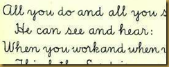
imageThese were all-purpose texts, too.  Even the McGuffey readers included “Slate Work” in the form of script-handwriting lessons interspersed with the with the stories and poems.  Of course, these, too, were designed for double duty, dishing out moral lessons about faith and hard work right along with the handwriting practice.

Kids today are daunted by script – I read somewhere about a girl who had to learn script so she could send letters back and forth with her grandmother.

What else is different today?

Forget about fonts.

imageToday’s kids’ books make liberal use of fonts – well, except for good old script handwriting, which seems to have been completely eliminated from our kids’ repertoire.

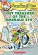
Indeed, books like the popular (accidentally typed “poopular,” maybe it means something?) Geronimo Stilton series (this page is from Lost Treasure of the Emerald Eye, one my kids adore), at times seem to rely more on font and novelty than on actual plot – let alone moral virtue.

(Not a fan of this series, but not for any reason I can put my finger on, and I’d never forbid the kids from reading them based on my own intuitions.)

0307010856Anyway, who can blame them when there is such marvellous precedent from the previous generation of kids’ books, the books of the 1970s and 1980s that were the first to break with morality, convention, with everything?

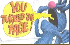
imageInstead of these tried-and-true formulas, this generation created fun, eclectic Free-to-be-type books that (sometimes literally, like in Grover’s 1971 classic, The Monster at the End of This Book, smashed all precedent to create the totally new artform in which Geronimo Stilton is free to play today to his heart’s content.

image 

(Okay, it’s late, I’m tired.  Hands up; bonus hug for anyone who followed that last sentence!!!)

Forget about trees.

Today, you get taken to task if you don’t make careful use of whitespace – or, what those early children’s book pioneers would call “intentionally waste space in your book.”
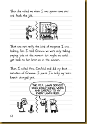
image 0810983915And rather than one picture per story (regardless of how many pages each story ran), you'd darn well better include a picture on each page if you expect hold kids’ attention.

Better yet, make like successful Diary of a Wimpy Kid author Jeff Kenney and many of today’s graphic novelists and forgo the words part altogether.  (Okay, comics and Diary of a Wimpy Kid HAVE words… but they are generally incorporated among other graphic elements, rather than carrying the story alone.)

Forget about stopping progress.

Not that I want to!  I love today’s kids’ books.  I’m not panicking about their future, by any means, and I’m always excited to see what the future will bring.

But sometimes, when I see the woeful choices my children make and chuckle over (this is code for the entire body of literature that relies primarily on fart jokes for its readers’ edification), I yearn for a simpler time.  Don’t we all?

0694003611I yearn for Goodnight Moon. (An Israeli woman once told me she found this canonical book creepy!  Really, it’s creepy to have an old lady in your room watching you fall asleep?  I always thought this was kind of sweet, but maybe she has a point.)

image

B00ES279V4I yearn for The Velveteen Rabbit.  (Does anyone still read this?  I thought about it once but realized it was too long to hold my attention span, let alone my kids’.  There – painful true confession.  Maybe I should try again now that they’re older.)

B000FCK65WI yearn for A Tree Grows in Brooklyn – a wonderfully shocking YA book easily as scandalous as anything today’s teens encounter.

Or is it perhaps not a simpler time I yearn for but a “fimpler” one, a world full of fimple ftories that won’t confound or confufe uf.  “Come, it is Auguft.  Buy a fharp fickle; you muft cut down the corn and eat fome.”

Ah, but you can’t stop progress.  Or, as Grover might put it,
image

What modern changes do you love in the world of kids’ books?  What can’t you stand?  If you could go back to visit any period of children’s literature, when would you pick?