Showing posts with label covers. Show all posts

Friday, February 9, 2018

What the Cat taught me: Lessons for authors from yesterday’s book covers

image

Do you have a favourite book from childhood?  You can probably visualize its cover, right? 
Just picture it in your mind's eye and maybe feel the nice, contented feeling that comes with curling up with a delicious book...

Well, this morning, I came across one of my preteen favorites sitting open on the floor where my daughter had left it when she went to school:  The Cat Ate My Gymsuit, by Paula Danziger:

image

This book meant a lot to me as a kid.  I think it was because of its open acknowledgment that life is sometimes lousy when you’re a teenager but also the gentle message that (thanks, Dan Savage!) it gets better.  That there is a light at the end of the tunnel.  And it does all that with the good-natured humour that the late Paula Danziger brought to all her books.image

I posted this picture on Facebook because it brought back so many memories.  But I also started thinking about both how dated the cover looks (it's from 1978) and also how I doubted publishers would put a picture like this, showing a slightly overweight, slightly depressed teen on the cover of a book today.

Searching Google to find a history of this book cover, and I discovered I was right.  The most current version of this book, on Amazon, just shows

Thursday, September 3, 2015

5 (plus 1) free contests exposed: for FEARLESS children's illustrators only

image

Do you want people to notice your book?

Not just because you'll sell more - though that would be nice - but also because you've put a ton of work into it.  You want to get it into kids' hands so they can enjoy it. 

And more than work, you've put a ton of love into it.
Maybe your illustrator has, too?

Doesn't his or her work deserve recognition, too? (Or your own if you're the illustrator.)

Are you fearless enough to toot your own book’s horn?  I hope so.

But most book awards are for the text of the book only.  What about those visuals??? 
In a children's picture book, they're supposed to carry half the weight of telling the story, yet they get so much less than half the recognition.

Most children's book contests miss this important point.  Here are four contests you'll love because they reward great art and illustration... along with one I hope you have.  (Plus, keep scrolling for a bonus contest.)

1.  INKed 2016 CALENDAR COMPETITION


https://www.facebook.com/pages/INKed/1583992151875285

This one's not specifically for kids’ illustrators, but it is open to anyone with a great sense of what you can do with ink on a page.  There's no cash prize, but this is a legit opportunity to get featured in a terrific calendar full of illustrations by talented artists all over the world.

Friday, June 26, 2015

How to have fun collaborating on a kids' book–with a kid

image

Hand in hand in hand in hand.  Collaborating on a meaningful book project together – why not?

The image is so beautiful.  Jodi Picoult writes with her daughter.  So maybe you’re wondering:  why can’t you write a children’s book with your son, niece, granddaughter, cousin, or any other kid you happen to have nearby?

image

(Jodi Picoult and her daughter, Samantha Van Leer, who have written two books together.)

The answer is a resounding yes.  YES!  Absolutely, you can.  You can write a book together, and have tons fun doing it.  Sure, you’ll both learn a lot, too, but shh… keep that part under wraps.  You don’t want it to seem too educational.

Kids adore making books.  More than just another boring creative writing project, they sense that by creating a book, they’re onto something important.  They’re bringing something wonderful into the world.  And you know what?  They’re right.

Follow these DO’s and DON’Ts to make sure you’re not disappointed, and that you both have fun from start to finish.

DO pick realistic goals ahead of time.

What’s your definition of success?  Be honest.  Pick a definition you can both agree on. 

Tuesday, June 9, 2015

So you want to write a children’s book…? The ultimate Quick-Start tutorial.

image

When I started out writing children’s books, I was full of ideas, but I had no idea what to actually DO. 

Should I write the story?  Find an artist?  How was it all supposed to come together into an actual book?  Like I said, I had no idea.

You might be right where I was a few years ago, wondering how to get started.

I’ve put this quick-start guide together to help YOU skip over the mistakes I made.  I hope it’ll help give you a smoother launch into this incredible world of writing for children.

1. How can you write (or finish) your book?

You can’t do much until you have a finished book saved on your hard drive (or, if you’re the old-fashioned type, written down on paper).  Here are the basics, the least you need to know to sit down and get writing.

Thursday, April 23, 2015

How to write an author bio that will sell children’s books

image

Have you ever READ an author bio?

Probably you have.  That’s because you’re a writer, so you’re interested in other writers.  At least, I know I am.

Here’s the thing:  you’re not a kid.  Let’s be honest:  it’s not kids who will be reading your author bio.

Most kids couldn’t care less about who wrote the book, unless they’ve finished one and are looking for more of the same.  So it’s probably parents, grandparents, teachers and librarians who will be reading the author bio. 

There are two kinds of people who are reading your author bio:

  1. People who aren’t sure whether they should buy your book
  2. People who have read your book and want to know more about you

In both cases, a little honesty can go a long way.  In both cases, you want to make a connection that is friendly and personal (not commercial!).  You want them to trust you and – maybe, just maybe – to like you.

Let’s look at ways we can make the bio as appealing as possible without being crass.  What you don’t want is for your bio to sound like marketing copy.

Here’s the trick:  you want your bio to be relatable, which means not too weird.  But you also don’t want it to be so tedious that you are ultimately forgettable.

What should you call yourself?

For some writers, the hardest part of creating an author bio is describing themselves in the third person.  As tempting as it may be to say “I’m a mom of 4, a SCUBA diver and a cat lover,” resist. 

Suck it up, and keep yourself in the third person.  It just looks and sounds better.

The best advice I can give you is to read 5-10 bios of well-known children’s authors before you sit down to write your own.  I think it’ll inspire you, offering hints as to voice and how to streamline your message effectively.

Go long or stay short?

Wednesday, April 22, 2015

Happy Spring with a FREE CHILDREN’S BOOK COVER TEMPLATE

DIY Classic Kids' Book Covers FREE with Write Kids' Books Cover Template

Around here, the weather is finally losing its chill (yeah, it gets chilly here in the land of sun, surf and palm trees!) and I just felt like celebrating.  We’re in that blessed period between “too cold” and “too hot,” and I feel great. 

Hope you do, too.

You probably know already that a great bookcover has the ability to move me.  You, too, right? 

That’s how we choose books, though sometimes we don’t like to admit it.  That’s also why I’ve put together the Indie Children’s-Book Cover Contest for independently-published books.  (Don’t forget to submit if you’ve published anything since November!)

So what does that have to do with celebrating???

It’s new – and it’s FREE

To help you really get into a party mood, I’ve created another FREE TEMPLATE – this time, to help you create compelling book covers.  You can use this template for any standard 32-page, 8.5" x 8.5" children's book.  And just to help smooth the process along, I’ve thrown in a 10-page help guide to creating dynamic, compelling covers.

Here's an idea of the kind of book covers you can create with this FREE template:

Sample children's book cover created FREE with Write Kids' Books Cover Template

Sample children's book cover created FREE with Write Kids' Books Cover Template

Sunday, January 4, 2015

Best of the Indie Children’s Book Covers – new contest for 2015!

image

2015 CONTEST NOW OPEN!

(FOR BOOKS PUBLISHED BETWEEN DECEMBER 1, 2014 AND NOVEMBER 30, 2015)

When it comes to marketing your self-published book, your cover is everything.  It’s a flyer, a billboard, a trailer, all rolled into one… and it has to be just as compelling in its teeny tiny thumbnail version.

I was so excited about my Top 19 indie kids’ book covers that I decided to do it even bigger and better for 2015.  Watch this space for details in the months to come.  Literally, this space.  Bookmark it and come back, as I will be updating this post once I know more.

To make this more about “great design” and less about “my opinion,” I’m bringing 3 other people on board to help judge the entries.  I’ll also figure out a couple of great prizes (beyond exposure), for books we all absolutely love – probably the Top 5 entries. 

(I will present the Top 20 entries on my site, with judges’ comments and links.)

Who’s Judging?

What are the prizes???

This is my first year doing this – hopefully, the first of many! – so I’m still rustling up some great prize ideas.  I hope they’ll include a blog tour (on relevant blogs) and book-related services.  Be sure to check back soon for more details!

Contest entry rules: 

Friday, December 19, 2014

Best & worst of the Indie Children’s Covers 2014: 19 hits, 10 misses.

image

UPDATE:  Want to enter the 2015 contest?  Open NOW to any children’s books self-published between Dec 1, 2014 and Nov 30, 2015.

Covers are hard.  If you’re like most people, I hope you don’t even try to do them yourself.  But even if you hire a pro, it’s easy to wander off the path of good judgment into the jungle of horrific, embarrassing covers.

That’s why we need objective feedback. 

Which is where Joel Friedlander, the Book Designer, comes in.  Every month, he hosts a cover contest.  It’s free to enter, and if you have a cover you love, you really should.  It won’t boost book sales directly, but it’s worth it, I promise.

Remember:  every single buyer is judging your book by its cover.  You can’t escape from that simple fact.

Every month, Joel shows off every cover he gets.  Sometimes he adds praise – but sometimes, his comments can sting.  One author proudly submitted his cover with the words “Fully designed by the author himself.”  To which Joel replied, “That’s apparent.”  About another cover, he wrote, “Impossible to tell what was intended here, but clearly this is a disaster.”  (My personal favourite:  “Pretty much announces: “I’m self-published!” And not in a good way.”)

I have to laugh – even when his criticisms are aimed at me, which they have been a couple of times.  Don’t submit anything unless you’re prepared for him to tear it apart.

Most of the covers he gets are for adult books.  Why not more kidlit?  Maybe because most of us aren’t putting enough money/effort into our covers, and aren’t proud enough of the results. 

That’s REALLY got to change.  I hope this list inspires you to create excellent covers that will hog all the top spots for 2015.

Here (in no particular order) is my personal Top Nineteen of all the kids’ covers that he’s featured in 2014.  NOTE:  I haven’t read the books.  I’m literally just judging them by their covers.

Down below, you’ll find 10 “misses” and “near-misses” that failed on one count or another to make it to that empty #20 spot in my “top” list.  Plus two grownup books with really, REALLY bad covers that make me wonder why anyone would submit them to a contest.  And one I loved that inspired me to buy the book.

#1

image

The Boy Who Loved Fire by Julie Musil.  There were many great YA covers this year; I think authors in this category are a lot more serious about their covers than if they’re just writing “kiddie books.”  (Again, that’s really got to change.)  Joel didn’t say anything when it was listed in January, but in March when he listed it again, he said, “Although a bit overwrought, it is nicely creepy.”

#2

image

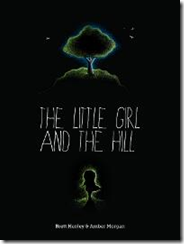
The Little Girl and the Hill by Brett Henley.  In January, Joel didn’t like the smallness of the text and I agree – you can’t read the author’s name, even with this fairly large thumbnail.  He said the art was lovely but that the cover overall is “a dark and easily skipped muddle.”  Still, something about this concept really appeals to me.  Like finding a good black t-shirt for a baby, it’s rare to see an all-black cover on a kids’ book.  (Caveat:  the interior looks similarly all-black, and I’m not 100% sure how good that would look on an ereader.)  I do wish they’d re-do the fonts, however.

#3

Thursday, December 18, 2014

Drat, foiled again (or the spineless truth about CreateSpace).

image

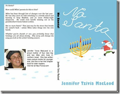
I told you a couple of weeks ago all triumphantly how I created a kissable cover and got around Amazon / Createspace’s arbitrary minimum-page requirements for having a proper spine on your book.  I succeeded that time with my 100-page chapter book No Santa!  image

But guess what???  When I tried the same magic again yesterday with an 88-page nonfiction book, Createspace stopped me in my tracks with their silly arbitrariness.

I worked long and hard to create a BEAUTIFUL (if I say so myself) cover, and submitted it along with my interior.  Here’s what the full design looks like:

image

(Spineless Wonders is the first in what I plan as a series of Jewish, Bible-based science books that’s already available for Kindle here.)

Believe me, everything fit perfectly within the little template they give you. 

image

But when I submitted all the files, Createspace’s gnomes went to work destroying all that is good.  They must have detected that I was trying to get away with something.  When my files were approved for proofing, I went in to take a peek… only to discover this message:

Wednesday, December 3, 2014

The joy of unboxing: start with creating kissable covers.

image

Want your books to come out of the box looking gorgeous?

You can have that, and I promise you, it’s a great, great feeling.  I love books.  That’s why I do this… it’s all about the books.  Well, that and the kids.  (Which do I love more?  Don’t push me on this question…)

The secret to gorgeous books is… kissable covers.  Covers that you adore.

And when these books came in the mail today, the first hard copies of my chapter book, No Santa!  , that’s exactly what I wanted to do.  Kiss them, hug them, sleep with them tonight and forever.

I was actually worried that they wouldn’t be this good.  Why was I so anxious?  Because…

  • a) this is my first chapter book, and
  • b) I was worried about the covers, which I created completely on my own, from scratch. 

I was especially worried about the spine.  Createspace told me that because my book was so short (exactly 100 numbered pages of story), there was no room for words on the spine.  Maybe you’ve come up against this problem, too?

I’ve held enough kids’ books in my hands to know that this was total BS.  Even very tiny, thin paperback books have words on the spine.

But Createspace insisted that I couldn’t do what I wanted to do. 

Monday, November 3, 2014

Ebook non-fiction: 3 rules to hook readers (and keep them coming back).

image

Ever felt like you couldn’t compete?

Want to know how your books can rise to the top?

Head over to Amazon and you’ll find a virtual deluge of nonfiction kids’ ebooks, and they’re not going away anytime soon.  Most are awful, a relic of the Kindle “gold rush.”  They repurpose free information, slap on free pictures, and charge anywhere between $.99 and $3.99 to call it a “book.”

I’ve recently converted a couple of the projects I created as a homeschooler into nonfiction ebooks, and discovered along the way that I really love writing kids’ nonfiction.  It’s even a little addictive once you get started.  I love creating books that teach kids about the world – in a fun way, so that ideally, they won’t realize they’re learning a thing.

So how do you do that in a way that doesn’t turn them off?  Or even do it in a way that keeps them coming back for more?  Don’t worry, it’s not as tough as it sounds (unlike getting them to line up for a second helping of green beans).

Staying afloat

Sure, it’s tough to stay above the tide.  It’s easy to despair when you see the numbers:  There is just so much out there, and more every day.

But I do believe that quality will rise to the top… or at least, some elusive mix of quality plus quantity.  If you publish a single Kindle ebook, it may not succeed, no matter how great it is.  But if you publish a whole series of them, and you acquire a loyal audience who enjoys reading them… then, I believe you will.

So how do you pick up that loyal following?

Monday, September 29, 2014

5 illustrated ways to overcome the “self-published” curse (and make your picture book look great).

image

Are you cursed?

Lots of writers would swear they are.

It’s sort of true.  There’s a “self-published” curse that makes many, many independent, print-on-demand and Kindle books look… bad.  Stinky.  Rotten.

Is yours one of them?

I don’t believe in curses, I believe in bootstraps.  I hope you do, too.

I believe that today every writer has a chance to succeed in publishing a kids’ book… by following these five tips (illustrated for your amusement) to help ensure that yours succeed.

Before you go on, here’s my confession:  I have made mistakes in all of the following areas.  Might be making them at this very moment.  Who hasn’t? 

That’s how we learn.

Let’s sit down and learn these five easy lessons (with illustrated examples by me!) together.

1.  Fonts – get serious.

There is a special place in purgatory for those who rely on Comic Sans to make their story seem childlike / innocent / fun.  Your book is made for reading… so make it readable. 

Script fonts can be hard to read, especially in large doses where there’s not enough whitespace around them.  Similarly, novelty fonts like this sawed-off-boards font make it difficult to read more than a little text at a time.  Finally, don’t mix more than three into your book.  I think the experts say four, per page… but I say three per book, so there.

image image

Sunday, January 19, 2014

Pink for girls, blue for boys… what would Roald Dahl do?


How do you feel when classic books, written and intended for ALL children, are remarketed today as “boys’” or “girls’” books – if not explicitly, then through subtle cues like colours and patterns on the cover?
I had the rare experience of going into an actual bookstore in a mall the other day, and because Naomi Rivka was with me, we ended up in the kids’ section.  (Okay, that’s a LIE – I end up in the kids’ section every time, whether I have kids with me or not!)
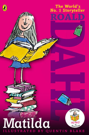
There, I spotted this brand-new, contemporary, SCREAMY PINK cover on Matilda, a classic, favourite Roald Dahl book:
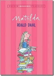
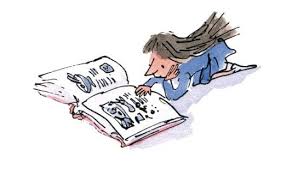
A Google image search reveals several evolutions of this book’s cover over the years.  Here’s what our worn-out old copy looked like, back when it had an intact cover:

Here are a couple of other nice early gender-neutral covers:
http://www.randomhouse.co.uk/docs/images/articleportrait/a6ca944a-eab5-4dab-b43f-c6e446a59a11.jpg
But this new stripey version is far from the first pinkish iteration, as you can see here.
Matilda by Roald Dahl
Same main character, new, girly-pink background.
I thought of this today because of a picture that’s been floating around on the Internet for a while now – an ad showing a little girl in the 1970s or early 80s, building with Lego.

The girl is wearing a neutral-coloured T-shirt (actually, there’s a bit of blue trim).  The Legos themselves are basic Lego colours:  blue, red, yellow, green, black.  Why?
Because Legos are a gender-neutral toy.
You can be a boy or a girl and still play with Lego – or at least, you could in 1981. 
In 2014, not so much:

0061711535Today, nobody seems quite so sure, as marketers rush to convince girls that all the best stuff comes wrapped up in a nauseatingly candy-coloured blend of pink and purple.  For more on the craziness and hype behind marketing to girls, particularly how it started, and the kind of money involved, there’s a great grown-up book called Cinderella Ate My Daughter, by Peggy Orenstein.
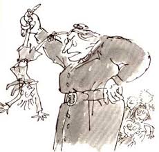
Here’s what I think Roald Dahl himself would have had to say about this type of silliness and any effort to sell Matilda as a book for or about GIRLS, instead of just as a book for and about PEOPLE:
0142410381I had a fun discussion with my kids around the table about this yesterday – about why Matilda is pink, for instance, but The BFG, which also revolves around a female main character (Sophie), is not.  (One kid thought this was because the other main character is a large and male giant, but I pointed out that the Queen of England also appears in the book, which ought to trump any old giant.)
0142410314In any event, we all agreed that the cover for Charlie and the Chocolate Factory, really ought to be brown (even though it isn’t).
And by the way – Roald Dahl?  Unbelievable writing role model.
Just in case you think book-writing comes easily to prolific and talented writers like Dahl, think again.  Here’s what he wrote in a letter to his own daughter, Lucy, about the process of creating his books:  “I must have rewritten Charlie [and the Chocolate Factory] five or six times all through and no one knows it…”
Here’s how the process went with Matilda:
…And now at last I have finished it, and I know jolly well that I am going to have to spend the next three months rewriting the second half. The first half is great, about a small girl who can move things with her eyes and about a terrible headmistress who lifts small children up by their hair and hangs them out of upstairs windows by one ear. But I've got now to think of a really decent second half. The present one will all be scrapped. Three months work gone out the window, but that's the way it is.
Think about that when you are weeping over cutting some precious paragraphs from a manuscript to comply with picky readers’ or editors’ (or – gasp! – kids’!) requests… three months work, out the window.
(I like this picture, by the way, because it proves that everybody used to smoke, not just evil stinky people!)
I bet I know what he’d do to anyone who tried to tell kids NOT to read it – which is essentially what a stripey pink cover announces to boys:  “Hey, guys, this is NOT for you!”

So what kept him going through all the difficulty?
My lucky thing is I laugh at exactly the same jokes that children laugh at and that’s one reason I’m able to do it.
Laughter.  Indeed.  The laughter of children, not boys, or girls… just kids.