Showing posts with label design. Show all posts

Friday, February 9, 2018

What the Cat taught me: Lessons for authors from yesterday’s book covers

image

Do you have a favourite book from childhood?  You can probably visualize its cover, right? 
Just picture it in your mind's eye and maybe feel the nice, contented feeling that comes with curling up with a delicious book...

Well, this morning, I came across one of my preteen favorites sitting open on the floor where my daughter had left it when she went to school:  The Cat Ate My Gymsuit, by Paula Danziger:

image

This book meant a lot to me as a kid.  I think it was because of its open acknowledgment that life is sometimes lousy when you’re a teenager but also the gentle message that (thanks, Dan Savage!) it gets better.  That there is a light at the end of the tunnel.  And it does all that with the good-natured humour that the late Paula Danziger brought to all her books.image

I posted this picture on Facebook because it brought back so many memories.  But I also started thinking about both how dated the cover looks (it's from 1978) and also how I doubted publishers would put a picture like this, showing a slightly overweight, slightly depressed teen on the cover of a book today.

Searching Google to find a history of this book cover, and I discovered I was right.  The most current version of this book, on Amazon, just shows

Thursday, September 3, 2015

5 (plus 1) free contests exposed: for FEARLESS children's illustrators only

image

Do you want people to notice your book?

Not just because you'll sell more - though that would be nice - but also because you've put a ton of work into it.  You want to get it into kids' hands so they can enjoy it. 

And more than work, you've put a ton of love into it.
Maybe your illustrator has, too?

Doesn't his or her work deserve recognition, too? (Or your own if you're the illustrator.)

Are you fearless enough to toot your own book’s horn?  I hope so.

But most book awards are for the text of the book only.  What about those visuals??? 
In a children's picture book, they're supposed to carry half the weight of telling the story, yet they get so much less than half the recognition.

Most children's book contests miss this important point.  Here are four contests you'll love because they reward great art and illustration... along with one I hope you have.  (Plus, keep scrolling for a bonus contest.)

1.  INKed 2016 CALENDAR COMPETITION


https://www.facebook.com/pages/INKed/1583992151875285

This one's not specifically for kids’ illustrators, but it is open to anyone with a great sense of what you can do with ink on a page.  There's no cash prize, but this is a legit opportunity to get featured in a terrific calendar full of illustrations by talented artists all over the world.

Wednesday, July 8, 2015

Beyond Comic Sans: 11 free fonts handpicked for children's book interiors

image

Have you fallen into the Comic Sans trap?

Comic Sans was considered a great font when it was first released in 1994.  But over the years, it’s gotten tired.  These days, many indie authors use and recommend it as a good font for kids’ books, because it’s clear and easy to read.  But it will brand you as an amateur more quickly than almost anything else.

I’m sure you recognize this – right?

image

Here are some great choices of alternative fonts you can use – and they’re all free, so there’s no excuse.

Friday, July 3, 2015

5 ways breaking rules makes your writing more powerful (a guest post)

image

We’re getting ready for our big family vacation in Canada, so I’m turning over the steering wheel to the capable hands of author and speaker Dawn Goldberg Shuler, who’s here to talk about…

5 Reasons to Break Writing Rules

imageAs a lifelong writer, former English teacher, and writing coach and communication consultant for the last ten years, most people think that I write perfectly, no mistakes in grammar, structure, punctuation... it's all perfect.

Nope! I don't write perfectly at all. Actually, I don't know that I ever write anything that an English teacher wouldn't get her red pen out for (case in point).

I do it on purpose. I start sentences with "And" or "But." I use ellipses as if I have a huge box of them, and they must be used! I use slang; heck, I use my own made-up words like "baddies." I end sentences with prepositions. I use numbers instead of writing them out. Sometimes my sentences are not complete sentences.

With my writing background, why in the world would I break writing rules? Here's the thing... I know exactly what the rules are, and, more importantly, I know WHY I'm breaking them. I have a reason.

Those reasons usually fall into one of five areas:

1. Makes the writing more conversational.

Makes the writing more conversational, so that it sounds as if I'm actually talking to you.

Wednesday, June 24, 2015

What do you need to know about the magic of threes?

image

Close your eyes and think of a number between one and ten.  Umm, now open your eyes so you can read the rest of this post.

Did you pick seven?  If not, you probably picked three or eight.

According to this mathematician, seven was the favourite number from among 44,000 people worldwide.  But the second favourite – maybe not the winner, but the first runner-up – was three.  And I think you will be, too, when you see how much three (3!) has to offer us as writers.

Why are threes so powerful? 

Physically, three is the lowest stable number that stands up on its own.  IF you’re building a step-stool, you can’t use just one or two legs.  You’ve got to have at least three.  (Okay, there is such a thing as a one-legged stool, but it’s more for propping your body up than actually sitting and relaxing on!)

Take a look – this is just such a basic, iconic design because of the central human assumption:  three = stable.

image

[source:  Nerijp via Wikimedia]

Even if you don’t think about it actively, your brain knows this, and so does your reader’s.  We trust threes in a way we do with few other numbers (even seven!).

Count your way through these 3 crucial principles of threes that will help you write better, stronger kids’ books.

1) The Three-Act Structure of your story

The three-act structure is a model used in screenwriting, writing and storytelling.  All it means is that your fictional story has three parts.  In fancier circles, these parts are sometimes the “Setup,” the “Confrontation” and the “Resolution.”  But I usually just call them Beginning, Middle and End. Winking smile

Tuesday, June 9, 2015

So you want to write a children’s book…? The ultimate Quick-Start tutorial.

image

When I started out writing children’s books, I was full of ideas, but I had no idea what to actually DO. 

Should I write the story?  Find an artist?  How was it all supposed to come together into an actual book?  Like I said, I had no idea.

You might be right where I was a few years ago, wondering how to get started.

I’ve put this quick-start guide together to help YOU skip over the mistakes I made.  I hope it’ll help give you a smoother launch into this incredible world of writing for children.

1. How can you write (or finish) your book?

You can’t do much until you have a finished book saved on your hard drive (or, if you’re the old-fashioned type, written down on paper).  Here are the basics, the least you need to know to sit down and get writing.

Monday, March 30, 2015

Illustrating your kids’ book on a shoestring budget: YES, you can! (here’s how)

image

Your book is perfect… now, do you know where are the pictures are coming from?

The other day at my SCBWI meeting (have you joined yet?), I mentioned my easy technique for creating a Kindle book from Microsoft Word, and I said, “you just take the words and pictures and pull them together in Microsoft Word.”  To which someone asked, “yeah, but where do the pictures come from???”

Everybody’s ears perked up.  Where DO the pictures come from?

You see, most of us are writers, not illustrators.  Some of us couldn’t even draw stick figures, even if our lives depended on it.

If you write AND draw, you’re lucky.  For most of us, writing is easy… and drawing our own pictures is an impossible dream.

But don’t worry – that doesn’t mean you’re stuck!  Here are three affordable ways (from cheapest to most expensive) that I’ve managed to get great pictures for my own books at prices that didn’t bankrupt me (yet):

1) Super-cheap:  Stock illustrations & photos

I told you a couple of weeks ago about how I get stock photos and illustrations for only $1 apiece… and sometimes, even less.  I really recommend you check it out.

Not every book is the right fit for stock photos, but sometimes, they can add a lot of fun to a story.  I’ve written a series of Jewish holiday children’s books illustrated with stock photos of animals.

Monday, March 2, 2015

Is your kids’ book blah or blechhhh? These 10 FREE font pairings add a professional touch.

image

Picture a mom, surfing Amazon one morning.  Maybe she’ll buy your picture book?  It’s perfect for her kids.  The cover sure looks promising, she thinks.  She clicks on it to Look Inside.  She skips through a couple of pages, and suddenly, she’s shaking her head. 

Something’s clued her in.  She’s figured out that your book is self-published and she suddenly has no desire to read any further.

What went wrong???

Readers don’t usually know exactly what’s turned them off about a self-published book.  But a lot of the time, badly-chosen fonts are the culprit.  Maybe your fonts are amateurish?  Maybe you’re using cruddy novelty fonts that make your book hard to read or dizzying on the page?

Today, there are so many great great FREE font choices out there.  Your book doesn’t have to be the one she clicks shut.  It could be the one she clicks Buy for instead and eagerly waits for it to show up in her mailbox so she can share it with her kids.

You may not be a professional graphic designer, but you should have some understanding of the basics of what makes a good font combination.  The fonts of your book should be:

  • clear
  • readable (for adults and kids)
  • normal, ie not attract TOO much attention

I’m sure you’ve seen children’s stories that look like this.  The text is muddled and hard to read:

image

So how can you rescue your book from falling into the same trap?

Ten free font combos to the rescue!

These 10 winning font combos are superheroes of the modern design world.  They’ll help you perk up any kids’ book and create just the right mood for your story.  These 20 fonts are all free, so there's no excuse to stick with Calibri, Times New Roman, Papyrus or (gasp!) Comic Sans anymore.

Sunday, January 4, 2015

Best of the Indie Children’s Book Covers – new contest for 2015!

image

2015 CONTEST NOW OPEN!

(FOR BOOKS PUBLISHED BETWEEN DECEMBER 1, 2014 AND NOVEMBER 30, 2015)

When it comes to marketing your self-published book, your cover is everything.  It’s a flyer, a billboard, a trailer, all rolled into one… and it has to be just as compelling in its teeny tiny thumbnail version.

I was so excited about my Top 19 indie kids’ book covers that I decided to do it even bigger and better for 2015.  Watch this space for details in the months to come.  Literally, this space.  Bookmark it and come back, as I will be updating this post once I know more.

To make this more about “great design” and less about “my opinion,” I’m bringing 3 other people on board to help judge the entries.  I’ll also figure out a couple of great prizes (beyond exposure), for books we all absolutely love – probably the Top 5 entries. 

(I will present the Top 20 entries on my site, with judges’ comments and links.)

Who’s Judging?

What are the prizes???

This is my first year doing this – hopefully, the first of many! – so I’m still rustling up some great prize ideas.  I hope they’ll include a blog tour (on relevant blogs) and book-related services.  Be sure to check back soon for more details!

Contest entry rules: 

Friday, December 19, 2014

Best & worst of the Indie Children’s Covers 2014: 19 hits, 10 misses.

image

UPDATE:  Want to enter the 2015 contest?  Open NOW to any children’s books self-published between Dec 1, 2014 and Nov 30, 2015.

Covers are hard.  If you’re like most people, I hope you don’t even try to do them yourself.  But even if you hire a pro, it’s easy to wander off the path of good judgment into the jungle of horrific, embarrassing covers.

That’s why we need objective feedback. 

Which is where Joel Friedlander, the Book Designer, comes in.  Every month, he hosts a cover contest.  It’s free to enter, and if you have a cover you love, you really should.  It won’t boost book sales directly, but it’s worth it, I promise.

Remember:  every single buyer is judging your book by its cover.  You can’t escape from that simple fact.

Every month, Joel shows off every cover he gets.  Sometimes he adds praise – but sometimes, his comments can sting.  One author proudly submitted his cover with the words “Fully designed by the author himself.”  To which Joel replied, “That’s apparent.”  About another cover, he wrote, “Impossible to tell what was intended here, but clearly this is a disaster.”  (My personal favourite:  “Pretty much announces: “I’m self-published!” And not in a good way.”)

I have to laugh – even when his criticisms are aimed at me, which they have been a couple of times.  Don’t submit anything unless you’re prepared for him to tear it apart.

Most of the covers he gets are for adult books.  Why not more kidlit?  Maybe because most of us aren’t putting enough money/effort into our covers, and aren’t proud enough of the results. 

That’s REALLY got to change.  I hope this list inspires you to create excellent covers that will hog all the top spots for 2015.

Here (in no particular order) is my personal Top Nineteen of all the kids’ covers that he’s featured in 2014.  NOTE:  I haven’t read the books.  I’m literally just judging them by their covers.

Down below, you’ll find 10 “misses” and “near-misses” that failed on one count or another to make it to that empty #20 spot in my “top” list.  Plus two grownup books with really, REALLY bad covers that make me wonder why anyone would submit them to a contest.  And one I loved that inspired me to buy the book.

#1

image

The Boy Who Loved Fire by Julie Musil.  There were many great YA covers this year; I think authors in this category are a lot more serious about their covers than if they’re just writing “kiddie books.”  (Again, that’s really got to change.)  Joel didn’t say anything when it was listed in January, but in March when he listed it again, he said, “Although a bit overwrought, it is nicely creepy.”

#2
image

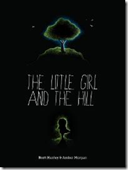
The Little Girl and the Hill by Brett Henley.  In January, Joel didn’t like the smallness of the text and I agree – you can’t read the author’s name, even with this fairly large thumbnail.  He said the art was lovely but that the cover overall is “a dark and easily skipped muddle.”  Still, something about this concept really appeals to me.  Like finding a good black t-shirt for a baby, it’s rare to see an all-black cover on a kids’ book.  (Caveat:  the interior looks similarly all-black, and I’m not 100% sure how good that would look on an ereader.)  I do wish they’d re-do the fonts, however.

#3

Thursday, December 18, 2014

Drat, foiled again (or the spineless truth about CreateSpace).

image

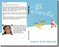
I told you a couple of weeks ago all triumphantly how I created a kissable cover and got around Amazon / Createspace’s arbitrary minimum-page requirements for having a proper spine on your book.  I succeeded that time with my 100-page chapter book No Santa!  image

But guess what???  When I tried the same magic again yesterday with an 88-page nonfiction book, Createspace stopped me in my tracks with their silly arbitrariness.

I worked long and hard to create a BEAUTIFUL (if I say so myself) cover, and submitted it along with my interior.  Here’s what the full design looks like:

image

(Spineless Wonders is the first in what I plan as a series of Jewish, Bible-based science books that’s already available for Kindle here.)

Believe me, everything fit perfectly within the little template they give you. 

image

But when I submitted all the files, Createspace’s gnomes went to work destroying all that is good.  They must have detected that I was trying to get away with something.  When my files were approved for proofing, I went in to take a peek… only to discover this message:

Wednesday, November 26, 2014

How NOT to get reviews. Three top turn-offs reviewers HATE.

image

You’re a writer, right?  So you’re only one letter away from being a WAITER, which isn’t a bad way to think of yourself when it comes to getting reviews.

Like a waiter, you have to serve up your book to reviewers in the most appealing possible way.  And if you forget the basics of customer service, it’ll bounce back to bite you in the form of a lousy tip – er, review.

Here are three ways you may be turning off reviewers – and what to do about them to make sure those reviews keep rolling in.

Monday, November 17, 2014

$5 to illustrate your book? Yes, please! (a fiverr artist speaks up)

image

My post How to get your children’s book illustrated for $5 on fiverr inspired a veritable poo poo storm of hostility, not just from non-fiverr illustrators, but from many others in the children’s book world. 

That made me sad enough that I wrote a follow up post , Why hiring a fiverr artist for your kids’ book WON’T destroy the universe which inspired a poo poo storm of its own.

So when fiverr artist Eka Saputra, from Indonesia, stopped by to share his views in the Comments section, I felt he deserved a post of his own to hopefully bring some sanity to this stinky storm.

Here’s what Eka has to say:

After reading this post and the previous one, as one of freelance illustrator in fiverr, I can't stand not to post a comment to show you my perspective.

Saturday, November 15, 2014

GUEST POST: Writing Children's Books: Using Proper Fonts

image

(Guest post by Irene Watson.)

Writing a children's book is hard, but so is illustrating and designing it. Yet everyone seems to think he or she can create a children's book. Plenty has been written about why children's book authors need feedback from children on the story before they publish a children's book. But just as important is getting feedback on illustrations and from the adults who might actually be the ones who read the book to children. No matter how good the story might be, more than with any other type of book, how a children's book looks is going to determine whether kids or adults want to read or buy it.

In other words, hire a professional illustrator and a professional layout and design person. In this age of computers and all kinds of graphic design programs, everyone thinks she can design her own children's book. The result is usually a disaster made by someone who doesn't understand that less is more. Many things need to be avoided when designing a children's book. Based on years of experience reviewing children's books and seeing what my children and grandchildren have and haven't liked, here are a few tips on what not to do:

Unprofessional Artwork

With a children's book, a picture is worth a thousand words, and trust me, little kids know the difference between good and bad art. You may not be able to tell what they are depicting in their own drawings, but they know when something "sucks."

Monday, November 10, 2014

DIY chapter books in Microsoft Word – a five-step cheat sheet.

image

Written five books for kids with nothing to show for it but a page of Kindle ebooks? 

It’s time to break into print, if only to have something to show your mom, and your friends, and your kids, and their friends, and… well, print books are just awesome in every way.  If you haven’t released one  yet, you should.

Even if your ebooks are selling great, you may not feel like a “real” author if everything you’ve done is digital.  There are other great reasons to print your stuff as well, especially for kids, even if the profit margins may not be as high as for ebooks.  (They’re not; sorry.)

It may sound like an exercise in masochism, but with a little patience, you can format your own book for print using nothing more than Microsoft Word.

The most popular thing on my site are my free children’s picture book templates, and it’s true:  I could have just made another template to help you do chapter books.  But take my word for it:  you don’t need a template for this.  I want to help you make the book you dream of, quickly and easily, using tools you already have.

That’s what this post is all about.

I originally wrote my new chapter book, No Santa!, in Scrivener, but I knew all along that print was in its future.  Scrivener can output to Microsoft Word format (.doc or .docx), but only provides minimal formatting.  Your book is definitely not ready to print yet.

santa2r

But don’t panic.  It won’t take much to whip it into shape.  You will need a slightly more-than-basic familiarity with Word, but you don’t have to be a guru.  If you’re comfortable with stuff like Styles and Margins, plus Headers and Footers, you’ll be okay.

Here’s your five-step cheat sheet to take your naked manuscript, Times New Roman and all, and turn it into a professional-looking print-ready PDF:

1) Use global Styles rather than formatting

Don’t format your text!  What I mean by this is don’t just highlight individual sections of your text and set them up to look the way you want.  Instead, assign each section of your text to a particular Style – either one of the many built-in styles or styles you create yourself.  You can change the way that style looks once you’ve done that, and then every instance of that Style will be changed at the same time.  You will save yourself a TON of work in the long run.

image

I assigned all my chapter titles to the Heading 1 style.  Heading styles are important because they will show up in your Table of Contents later on, if you create one.  Of course, all of your text should be in the same Style.  I usually use the built in Normal style and then tweak the Style for the size and font I need.

2) Choose fonts carefully

Sunday, August 31, 2014

Three FREE graphics programs writers need in their arsenal.

image

Need a quick tweak for an illustration or cover? 

It doesn’t have to be a pain.  I promise, I’ll make this as easy and low-tech as possible.

Ideally, a professional would handle anything image-related, from changes to illustrations to adding text to your covers.  But for small fixes, you’re not stuck with Windows Paint. 

And even if you’re not planning on doing a lot of image manipulation, there are good reasons why you need a reliable paint program to turn to from time to time.

Obviously, you don’t want to spend a ton of money, which is why I’ve gathered this collection of three good, stable choices that you can download and start using absolutely free.

(I don’t get any kind of kickback for suggesting these – they’re just good programs that I have used myself.)

Autodesk Pixlr (Desktop version)

This program is free, fast to load and pretty nifty.  It’s also very bare-bones.  There is an “upgraded” professional membership for $15 a year that gives you access to more features.  I don’t know that it’s worth it, but the free one is a handy tool to have.

image

What can it do?

Sunday, August 3, 2014

How to get your children’s book illustrated for $5 at fiverr.

a great children's-book artist at work

(I got royally flamed for this post on various children’s book writer and illustrator message boards.  Once you’re finished reading, whether you agree or disagree, read my response, Why hiring a fiverr artist for your kids’ book WON’T destroy the universe.)

UPDATE #2:  A third-world fiverr artist speaks up.  An important post for anyone looking to have their book illustrated, whether through fiverr or not.

Written a book and now you need pictures?

Some of us have the artistic talent to illustrate our own books.

Some don’t have to think about pictures because they’re hoping to snag a traditional publishing contract (don’t even think about submitting a manuscript with pictures unless you’ve drawn them yourself).

For the rest of us… there’s shelling out for illustrations.  And one popular way to do that is through fiverr.

I’ve ordered and received literally hundreds of illustrations through fiverr now – and had mainly good experiences. 

Are you truly going to get away with spending only $5 per picture? Probably not… but that $5 price tag is going to help you out in a few ways, so keep reading.


Fiverr illustrations… step by step.

Here’s how I get my pictures done through fiverr:

1) Write a great book. I don’t even think about pictures until the book is just about perfect. Typos, maybe. But the plot and scenes should be finished.

2) Divide your book into pages. Don’t leave this to chance. You wouldn’t walk into a housewares store and say, “I need… some plates.” No, you need 8, or 12, or however many. So don’t wander onto fiverr with the vague idea that you need “some” pictures.

Thursday, June 19, 2014

Basics, Part 2: Does your book measure up?

image

How long is a children’s book?

Figuring out how long your kids’ book should be is easy:  you start typing at the beginning, and stop when it’s long enough.  Or do you?

In the first post in this series, Basics, Part 1: What is a children’s book? we looked at the most simple definition of a children’s book: 

  1. Pages between covers
  2. Aimed at young readers
  3. Usually illustrated
  4. All about story

I’ve talked a lot over the last little while about points 2-4, but not so much about #1, namely – how many pages should be between your covers?

I’ll tell you in a second.  In fact, I’ll go one better and give you a handy chart.

But first – I want you to remember that word lengths and all this technical stuff has NOTHING whatsoever to do with #4, “all about story.”  Your children’s book is primarily about story, and when you’re writing your first draft, just write. Don’t even think about word length.

Saturday, May 3, 2014

The one thing you MUST do before hitting Publish.

reading Have you looked at a kids’ book lately?  Before you hit Publish, take a minute to haul a few kids’ books off the shelves.  If you don’t have any, go to the library and bring some home.  Let’s look at them together. 

What are we looking for?  Bear with me, because we, my friend, are looking for secrets that will rescue your book from the morass of terrible self-published children’s literature out there.  Okay, I call it literature here to be nice.  It isn’t always; sometimes, frankly, it’s just books.

There are 5 main things you’ll want to look in that stack of REAL, professionally published children’s books that will save you a ton of heartbreak if you’re self-publishing and getting your own book ready to print. 

This will take a little time up front, but you’ll thank me, really you will, when your book comes out looking nice and professional in the end.

So just grab one of the books off that pile, open it up, and take a look…

Thursday, April 3, 2014

Deconstructing the story: Mini-Interview with Writer/Illustrator Rinat Hoffer

image

Rinat Hoffer is probably the most popular and perhaps prolific children’s-book author in Israel today. But for me and my kids, she’s something more – a friendly, fun bridge to Israeli culture and life in this strange, busy, modern country.

We first “met” her books back in Canada at our local public library. I can’t tell you how long it would take me to pick books from their Hebrew books shelf.

Before continuing, I just want to show you what MOST of the Hebrew kids’ books that I found looked like inside:

clip_image006

Yes, they really were this bad.  And this is one of the good ones.  I mean, the bunny and girl are kind of cute.  It’s just dated, with little sense of design and overly dense text.

The language inside (and these are kids’ books, not War and Peace!) was almost as incomprehensible to me as it is to you (unless you’re fluent, in which case, skip to the end – there’s a video). And the art… well, growing up with many of the classics of modern kidlit, something was definitely lacking.

Even back in Canada, Rinat helped change my mind completely.