

In some forms of Christianity, there are Seven Deadly Sins, for which one presumably can’t be forgiven. If you take children’s books seriously, like “on the level of religion” seriously, then it stands to reason there will be Deadly Sins here, too.
I know I sound like a hopeless snob, but I believe there are three sins that you, as a self-published writer, must NEVER commit if you want me to take your book seriously. These are errors that scream out, “I’m putting out my own book – on the cheap!”
I’m going to LIST the sins here. And talk about them, too. But I’m not going to give examples.
Because it would be mean to single out writers whose work suffers from these sins, even though I’ve seen more than a few in books I’ve received to review over the last few weeks. And because I’m not on such a high horse that I’m above making mistakes myself.
So I’m going to list the sins – and then give counter-examples, from books I really like. We can all learn from good examples, and let the bad examples lie stinking in the gutters.
STRIKE ONE: LOUSY GRAMMAR
Easy-fix grammar problems are the worst, worst, worst thing to find in a book. At least for me, that is. They stop me cold and I simply cannot go on without great difficulty.
This is true whether the book is aimed at kids or adults… but I feel particularly strongly about good writing in kids’ books. They’re vulnerable in a way grown-ups aren’t; we don’t give them full-strength grown-up medicine, so we probably also shouldn’t give them full-strength typos.
This one’s easy to fix.
First of all, and happily for all the mediocre authors out there, not everybody is as picky as me – some people just won’t notice if they come across a grammar error. Also, happily, lousy grammar is one of the easiest fixes. There are professional grammar nitpickers – I’m one of them! – who are happy, for a small or large fee (mine’s on the small side), to make sure your book is free from mistakes.

Beezus felt that the biggest trouble with four-year-old Ramona was that she was just plain exasperating.
and
She wanted to be a fourth-grade teacher and drive a yellow convertible and live in an apartment house with an elevator and a buzzer that opened the front door.
Either of these sentences could have gone wrong so easily, and do every day in the hands of self-published children’s book writers.
In the first example, your typical writer of today would probably avoid that string of “with… was that she was,” thinking it was too complicated for kids to understand. She’d be wrong. If that’s what you want to say, and you’re positive you’re saying it right, go for it. But if your brain is fuzzy and you’re not sure it’s coming out right and you just sort of “hope” the words will end up in a meaningful order – stop, think it through, write it carefully… and then, hire an editor.
That second sentence is just simply a beautiful example of parallel structure. Beezus wants to “be” and “drive” and “live”… and her apartment house will have “an elevator” and “a buzzer.” Magically, we know where the list of goals ends and the list of apartment attributes begins. Parallel structure is where lots of us, including me, go wrong, lots of the time, but again, in the hands of a clear-minded writer and a careful editor, the ideas emerge unscathed and perfect.
STRIKE TWO: FUZZY AUDIENCE
Who will read your book? In the first few pages, you make a few promises that you must fulfill throughout the course of the book. Before you make those promises, you have to ask the reader, “Are you the right audience for this book?”
Here are four marvellous book openings I pulled at random from our growing ebook library. All are from works of fiction. Two are for children, two are not. See if you can guess which is which:
(1)
Ba-room, ba-room, ba-room, baripity, baripity, baripity, baripity—Good. His dad had the pickup going. He could get up now. Jess slid out of bed and into his overalls.
(2)
When I was seven, I knew exactly who I was: a thoroughly American girl in race, manners, and speech, whose mother, Lulu Minturn, was the only white woman who owned a first-class courtesan house in Shanghai.
(3)
One cold rainy day when my father was a little boy, he met an old alley cat on his street. The cat was very drippy and uncomfortable so my father said, "Wouldn't you like to come home with me?"
(4)
I don’t have to look up to know Mom is making another surprise visit. Her toenails are always pink during the summer months, and I recognize the flower design imprinted on her leather sandals; it’s what Mom purchased the last time she signed me out of the bad place and took me to the mall.
Did you figure out which were which? It’s actually not as easy as you might think. The kids’ books were #1 and #3.

 Book #2, Amy Tan’s The Valley of Amazement, and book #4, Matthew Quick’s The Silver Linings Playbook, might have thrown you off because they are adult narrators who seem a bit childlike. In the fourth one, the narrator speaks about his mother.
But in the Amy Tan book, it’s pretty clear that most children’s books wouldn’t make reference to a “courtesan house.” And in Quick’s novel, within just a few more lines, the narrator tells his mother, “Nikki—likes—a—man—with—a—developed—upper—body,” I say, spitting out one word per push-up, tasting the salty sweat lines that are running into my mouth.” Clearly, he’s a grown-up after all.
Whether for kids or adults, a book’s audience must be very, VERY clear right from the start.
Once the author has picked the audience, he or she can never deviate. But amateurs do, all the time, especially (sorry) in self-published books. Writers start out writing for a very young audience, then throw in some big words or a reference only a preteen could understand.
(Not that I think kids necessarily need to be protected from big words, but that’s a topic for another post!)
Is mismatched art driving your audience away???
One HUGE audience mistake amateur writers make: a “big-kid” book ruined by little-kid art (it usually goes that way – rarely, it’ll happen in the other direction). The story is about a topic that’s genuinely interesting to, say, 8-10-year-olds… but then the writer has chosen pictures show big-headed toddlers or baby animals.
In a picture book, words and pictures must woo the audience together. If there’s a conflict, then basically nobody will read your book.
Speaking of art, we’ve arrived at Strike 3…

 Oh - what were the other two books, you ask? The two children’s books were #1, Bridge to Terabithia, by Katherine Paterson, and #3, My Father’s Dragon, by Ruth Stiles Gannett (a surprisingly charming old book that is now in the public domain, so you can read it free if you have an ereader hanging about!).
So yeah: here’s Strike 3…
STRIKE 3: BAD ART
Or, Oh, boy is there a whole lot of terrible kids’ book art out there.
Now, sometimes, this is a matter of taste. But sometimes, it just isn’t. Sometimes, the art in a kids’ book is just empirically bad. And here, I am going to show you a few examples – not from actual kids’ books, but from artists promoting themselves as “children’s book illustrators” on fiverr.com.
I feel okay doing this because the artists feel this is their best possible work, and all pictures here are linked back to the pages where I found them – so if you like their work, feel free to invest in it!


Now, most of these are not pitifully bad… they fall into the “almost-but-not-quite-bad” category that’s sort of sadder than if they were completely lousy artists. To me, bad art is as jarring as a typo – it just throws off the whole style of the story.
There are some reasonably good artists on fiverr as well, by the way. Generally, they charge more than $5, but in my books, that’s okay. (Working with fiverr artists is a topic for a whole ‘nother post, so I won’t list more right now). Here’s one I saw just now that I sort of liked:

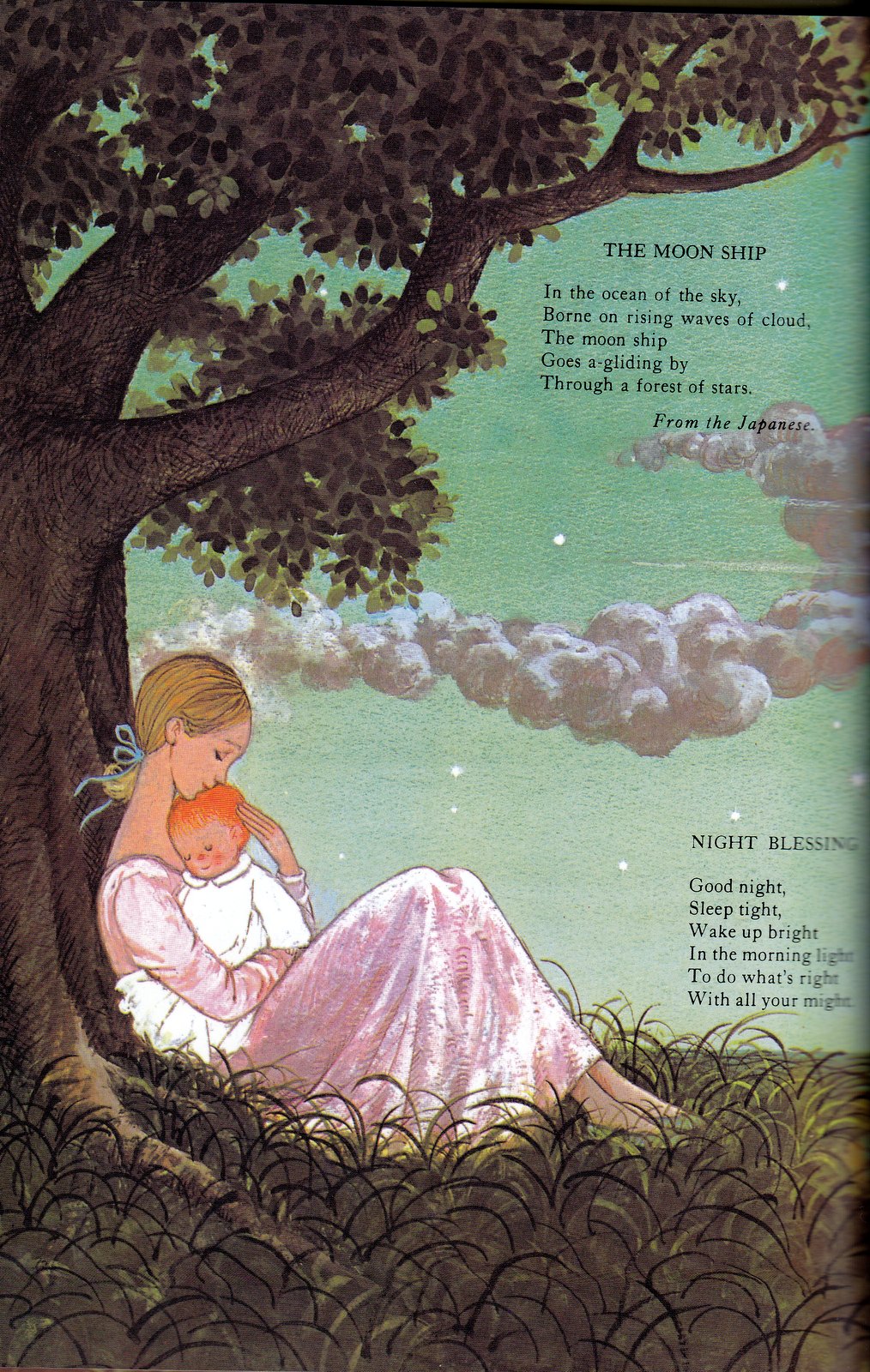
But here – on the other hand – is what you get in some of my favourite picture books…
From The Dark, a new find by Lemony Snicket, illustrated by Jon Klassen.

From A Child’s Book of Poems, collected and illustrated by Gyo Fujikawa (this is not a style I usually like, and not my favourite kids’ poetry collection, but she won me over with the rich attention to detail – particularly in nature – that she’s brought to every poem!).

From The Princess & The Pea, written & illustrated by Lauren Child (I don’t necessarily love her retelling, but the art is well worth seeing, and there’s a fascinating section at the end about how she does the art).

From the lavishly-illustrated I am a Bunny, by Ole Rissom, illustrated by Richard Scarry (unlike the others, an old old OLD favourite from my own childhood!).

Look – I’m a self-published children’s writer. I know that illustrations are the most expensive part of putting together your own kids’ book (unless you’re spending more on editing – in which case, good for you!). I think I hold myself to the same high standards as I hold others – even if none of the illustrators I’ve worked with are of quite the same calibre as Richard Scarry.
I’ll be the first to admit - this last strike is trickier than the other two.
It’s much harder to judge whether the art in your book is BAD art or GOOD art – certainly, harder than it is to tell whether your writing contains spelling or grammatical errors, or problems finding its audience.
Here are some of the memorable characters I’ve had the good fortune to “meet” in my own books (clickable if a book is currently available):


I’ve also hired artists and then not enjoyed what they came up with; in a couple of cases, scrapping the project altogether or finding another illustrator… simply because I didn’t want my book to fall victim to this nebulous, but important, Third Strike.
So what does it mean if a book strikes out???
Quite simple, really. If a book strikes out in any of these categories, I won’t read it to my kids. There are very few exceptions (many classic Israeli and/or Jewish books fail in the art category – some of them, I read anyway).

So in this case, I mean it just the way I say it. Three strikes… and you’re off the playing field, as far as I’m concerned.
Do you agree? Or do you think I’ve included too many Deadly Sins… or not enough?? Let me know what you think!


Jennifer,
ReplyDeleteI couldn't have agreed more with your article...especially the 3rd sin. Speaking as an Illustrator and a dad who loves to read to his 4 year old, nothing frustrates me more than reading, (or trying to), a good story but having to endure the artwork that has been matched to it. I know that an author who plans to self-publish has a limited budget, but in my experience I've seen too many go the route of "cheapest, fastest art-hack" and that does a disservice to all of us, reader, writer and visual artist. (Usually for the artist, it becomes a price race to the bottom....:( )
I couldn't agree more when it comes to artwork. It is the first thing I do when I pick up a book for the kids, I flip through to check out the pictures before I even read the text. I know, I know, totally judging the book by the cover, but seriously, it is such an important part of the reading experience.
ReplyDeleteSo, you edit... do you stick only with a particular genre or will you edit any work? I think I'm getting to the point where I'm ready for an editor :)
Hmm... yes, but I hate quoting rates. Guess I have to get over that. :-)
ReplyDeleteI will message you privately about the rates ;) I am working on the third draft now, sealing up some plot holes and timeline issues. After that it should be ready for professional editting.
ReplyDeleteSo exciting... although tying up loose ends can be a pain, too. :-)
ReplyDeleteGreat post. As an illustrator, # 3 particularly resonates with me. When it comes to picture books, the artwork is equally as important as the story, if not more so. As you said, these types of books ARE judged by their covers. As with most things in life, you get what you pay for. Authors who don't want to invest in the illustrations, or who bargain shop are setting themselves up for disappointing sales.
ReplyDeleteIndeed, that's what I keep hearing from professionals... who are offended to death that someone would call him/herself an illustrator and charge $5 for a picture. I can't wait until I can really afford to put more into this end of things. But even on a skinny budget, I try to get the best possible images. Thanks for stopping by!
Delete