

Are you cursed?
Lots of writers would swear they are.
It’s sort of true. There’s a “self-published” curse that makes many, many independent, print-on-demand and Kindle books look… bad. Stinky. Rotten.
Is yours one of them?
I don’t believe in curses, I believe in bootstraps. I hope you do, too.
I believe that today every writer has a chance to succeed in publishing a kids’ book… by following these five tips (illustrated for your amusement) to help ensure that yours succeed.
Before you go on, here’s my confession: I have made mistakes in all of the following areas. Might be making them at this very moment. Who hasn’t?
That’s how we learn.
Let’s sit down and learn these five easy lessons (with illustrated examples by me!) together.
1. Fonts – get serious.
There is a special place in purgatory for those who rely on Comic Sans to make their story seem childlike / innocent / fun. Your book is made for reading… so make it readable.
Script fonts can be hard to read, especially in large doses where there’s not enough whitespace around them. Similarly, novelty fonts like this sawed-off-boards font make it difficult to read more than a little text at a time. Finally, don’t mix more than three into your book. I think the experts say four, per page… but I say three per book, so there.


(Note: This last example was a fundraiser for a charity, and my selection of this example is no reflection whatsoever on the charity or even on the book itself… just on the use of Comic Sans. I promise!)
More on fonts and typefaces:
- Best fonts to use for your book (from BookPromotionHub)
- Basic terms & rules of fonts (from Wikibooks.org)
2. Front matter – matters.
Especially on the copyright page, this is no place to get silly. Even if it’s a silly book. Pull a silly book, a funny book, any kind of humourous thing off your shelves and take a look at the copyright page. Unless it’s that rare exception, I’m betting it’s one of the least-funny things you’ve ever read.

Every copyright page should contain the copyright notice, which should be worded something like this:

This is not a place to get funny. It is a place to assert your legal rights – and that’s it. No hiding “Easter Eggs” in there anywhere. This is a legal document; take it seriously.
More on front matter:
- 7 self-publishing mistakes that can sabotage your book (see “overstuffing the front of your book”)
- 5 layout mistakes that make you look unprofessional, from the Book Designer (Joel Friedlander)
3. Don’t get cute: be professional.


Don’t include in-jokes that only your family, friends or other loved ones will understand. Don’t thank your hamster in your acknowledgements section unless you’re really, truly grateful. If you’re planning to use a publishing company name, that’s fine; just make sure it’s something professional.
There is a time and place for cute, and YES, a children’s book is one of those times and places. But at the same time, you must convince parents (buyers) that you, an adult, have put time and energy into creating your book. Don’t reveal embarrassing nicknames or make a fool of yourself. Here’s a thought: imagine pulling someone else’s kids’ book off the shelf. If you’d cringe to see something in there, don’t put it in yours.
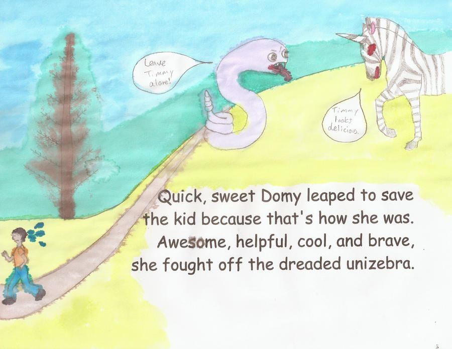
And whatever you do, if you are not an artist, don’t draw the pictures yourself (or use pictures you’ve taken of assorted random things around your house / farm / car / pets). That’s not cute, that’s sadistic. No clip art, either.
More on professionalism:
- Self-publishing is not the minor leagues (a strongly worded manifesto),m from Chuck Wendig
- Self-publishers should not be called authors – a post I disagree with in many places, but still important reading, from Michael Kozlowski
4. Margins & whitespace – respect them.

Lots of writers seem to resent whitespace and margins. Maybe they think they’re stealing space from the story.
I know that’s not you we’re talking about, right?
You, I’m sure, already realize that whitespace and margins ARE your story. Or at least as much a part of it as the words and pictures.
Honour your story by giving it room to breathe. Your illustrations, too. They will shine if you let them, rather than squishing everything in around them.
More on margins & whitespace:
- Top Ten Worst Self-Publishing Mistakes – Explained (from Joel Friedlander)
- Making space for nothing – 5 books, 5 experts on whitespace
5. Cover - your beeeeehind.
No borders. No cropped pictures. Choose a picture that fits your cover. If that’s impossible, choose a picture that can be merged with another picture (like the sunset in the cover on the left, an effect I actually sort of like, sometimes).
Although you have a bit more freedom with fonts on your cover, don’t overdo it, either with display / novelty fonts or blah fonts. No Times New Roman, Comic Sans, or Arial on your cover, period.


If you’re planning on doing a print book, make sure the text and pictures on your cover don’t creep too close to the edge. Scotty Writeman here is in trouble if he tries to submit this cover to Createspace. And if you’re planning on selling on Amazon (if you’re not, don’t bother reading on anyway), always consider what your cover will look like as a thumbnail. Fine lines will vanish… is your title still readable? Play around with different sizes to make sure.


Want to include a great quote on the front of your book? Maybe you can. But make sure you let readers know who said it – otherwise, it’s just meaningless praise. You could have written it yourself, for all buyers know (and maybe you did).
Have a BEd, a PhD, an MD, or some other academic recognition? Well, that’s great! (really; I’m not being sarcastic…) Just make sure you keep it off your book cover. Kids don’t care – all they want is a good book. True, parents may want an authority to stand behind the book, but hopefully you can slip that information in elsewhere, like your Amazon author page or the back cover.
More on covers and cover design:
- Cover design with Author and Artist Jason Gurley, from the Self Publishing Podcast (sorry, you’ll have to listen to or watch this one)
- Top 8 cover design tips, from TheBookDesigner, Joel Friedlander (I love this guy!)
6. Sticker shock.


Price your book as low as you can.
You will not make money off individual print copies, so don’t even try. Sure, it’s your right as a writer to sell your book for $27.89 (your lucky number) without even letting us look inside. And it’s our right, as buyers, to pass on your book, especially when it’s brand-new and has no reviews.
The biggest mistake new writers make in self-publishing, whether in kids’ or grownup books, is looking around at comparable books in their category. That’s valuable for other reasons (see “checking out the competition”) – but deadly when it comes to price.
John Grisham or Stephen King might be able to charge $15.99 for a brand-new paperback novel. You can’t. They are tried and true “brands.” You aren’t. Without a few more books under your belt, and a ton more reviews (here’s how to get reviews for your book), you should be thinking about pricing yourself at rock bottom.
I’m assuming here that you haven’t quit your day job to go write children’s books. In other words, you still have a source of income. Writing isn’t going to be it… for a while. And even if and when (yay!) it does become your bread and butter, you’re still not going to make a ton off any given book. But you will have lots more books out there, and way more social proof so you can start inching your prices up accordingly.
I really mean it about Look Inside, by the way. It is intimately related to pricing. A writer asked on a message board last week about why her book wasn’t selling. Turns out it is a slightly off-beat concept, from a brand-new writer, asking $3 for a Kindle-only book that you are not allowed to peek inside.
Imagine a guy sitting on the street holding out a sealed paper bag. He asks you if you want to buy it for $3. Um, no. What’s inside? Exactly.
More on pricing:
- How to set the right price for your indie book, along with strategies, from PBS.com)
- Ten tips for pricing your book profitably, from selfpublishedauthor.com
7. No awards, please.
Unless it was the Pulitzer or Caldecott, we don’t need to know about it. If you have won an award, chances are (sorry) that you paid for the award. There are lots of contests out there, and sooner or later, any author or any book can find one she will win – almost guaranteed. That means that most awards are worthless.
Here is one award where you can pay them $60 and they will consider adding you to their list of “50 great authors” for any given year. Let’s be conservative and say they had 100 entries (it was probably many more). So that’s… $6000. What do they offer, in return for $6000 of writers’ hard-earned money?
- a headshot on their site
- a link to their book’s site
- a “digital seal” that looks like this:
(snazzy!)
- um… that’s it.


More on awards:
- Award scams and profiteering, from Writer Beware
- Are book awards worth the cost?, from SmallPressWorld.com
Still feeling cursed after reading all that?
Nonsense.
You should feel inspired. Yes, all these details are important, and they may not have been part of what you thought you were getting yourself into when you decided to write. If you self-publish, you have to fill a lot of roles that are taken care of by a publishing company.
But who’s the best person to push your book? To polish it up and really make it shine? YOU are.
Ultimately, a publishing company will never care about YOUR book. You care, and that will make all the difference.
With that caring, plus some simple tips for avoiding the more obvious mistakes, you really can write and publish your own children’s books.
The truth no publisher wants you to know is that, these days, readers not only don’t care if you published your book yourself… if you play your cards right, they won’t even be able to tell. That’s what this is about.
So let’s shake off the stink, roll up our sleeves, and get started writing (and selling!) kids books that smell like… books.
These are my 5 tips. Did I miss anything? Let me know in the comments!


Hi Jennifer. This is your best column yet.
ReplyDelete(((blush))) thank you, Earl. It's so lovely to hear this, knowing that you also don't hesitate to let me know when you don't like something I've written. :-)
DeleteJennifer,
ReplyDeleteI always enjoy reading your no-nonsense advice. In addition to pulling up the bootstraps, I'd suggest pumping the brakes. A writer in a rush is a writer heading for a fall. Thanks, once again, for your tips, and for inspiring me to lend a hand to others who've buckled up for this wild ride.
Michelle
Hmm... "writer in a rush" sounds eerily familiar. But I do force myself to slow down when it's absolutely necessary. Thanks, Michelle!
DeleteGreat advice! My pet peeve is when authors are too cheap to have their books professionally edited. It's expensive, but it is really crucial! Save up!
ReplyDeleteAngela, I totally agree... but I will also add here that writers can save at least some time and money with my book, The Seven Day Manuscript Machine, which walks writers through the basics of self-editing in a non-threatening, seven-day program. Doesn't mean they won't still need a pro - most writers will - but at least you won't be wasting their time on stuff you can clean up yourself.
DeleteThanks for sharing this!
great blog!
ReplyDeleteAww... thanks, Linda. It took more work than usual because I'm not really a graphics person (but I was chuckling as I did it!).
DeleteI'm not a fan of Comic Sans either, but I feel like the recent bad press it's been getting is exaggerated - kind of like everyone suddenly deciding that Avatar was a lousy movie. I just noticed a few days ago that Laurent de Brunhoff's "Babar's Museum of Art" is set in 16 pt Comic Sans - clearly, tastes have changed since 2003, but does the font really deserve such vilification? It's probably good advice to steer away from it, if only to avoid the "free font for self-publishing" tag, but if you have a good reason to choose it (and not to choose Comic Neue), go for it, I'd say.
ReplyDeleteI like Comic Sans, really I do. It is interesting to see how tastes change. Certainly, I have contributed more than my share to its overuse and ultimate reader fatigue, I think.
DeleteThen again, I was shocked to discover the existence of Papyrus hate blogs, such as
http://www.papyruswatch.com/
http://doespapyrusbelonghere.tumblr.com/
I have always kind of liked Papyrus, even if it is a bit messy and spacey and all over the place, but apparently, it's a crime to use it for anything anymore...
Thanks for stopping by!
We used Papyrus for our wedding invitation. 'Nuff said. :-)
DeleteThis comment has been removed by the author.
ReplyDeleteGREAT article. Loved every bit of your advice :) So true and so funny!
ReplyDeleteThanks, Elizabeth Grace. I appreciate your hopping by!
Delete