
 It’s called “white space,” but it doesn’t have to be white. Are you using enough of it in your kids’ books? I’m going to show you five books that do a GREAT job with white space – in a couple of cases, becoming classics along the way.
And then, because (gasp!) creating white space is one of my weak points… I’m going to share with you not my own wisdom, but that of five experts who have Things to Say and manage to say them far better than I could.
To get us in the mood, here are five kids’ picture books that make GREAT use of white space:
1. Leonardo the Terrible Monster, by Mo Willems


2. The Tale of Peter Rabbit, by Beatrix Potter


Peter Rabbit was actually one of the earliest kids’ books to include such copious amounts of white space around illustrations both anthropomorphic and realistic (ie animal-like).
3. Little Blue and Little Yellow, by Leo Lionni


4. Goodnight Moon, by Margaret Wise Brown

(Ha! A whole blank page… for nobody!)
5. The Dark, by Lemony Snicket, illustrated by Jon Klassen
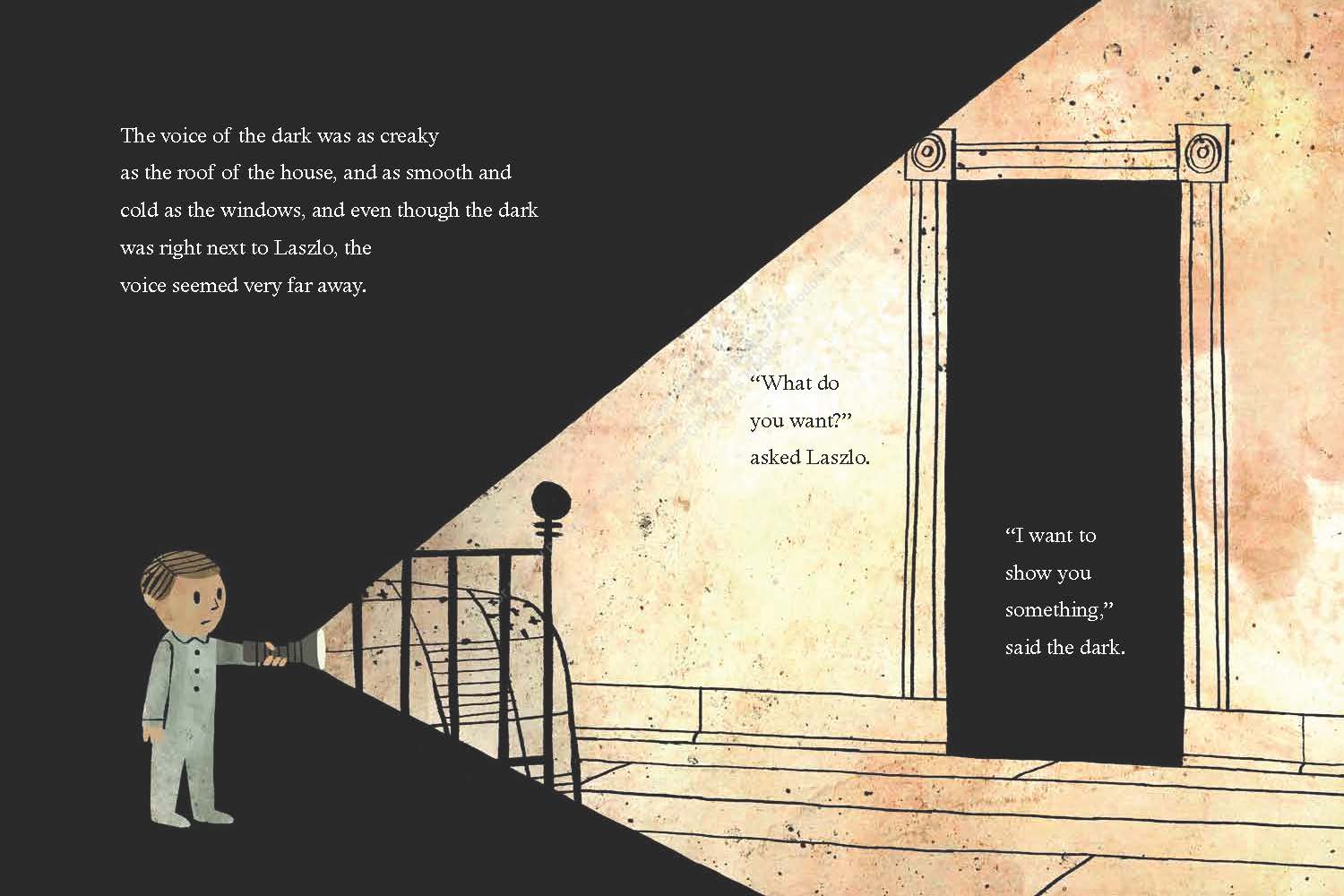
(Creepy-cool in a goth kind of way because most of the “white” space in the book is actually black!)
The secret of white space
… Notice that all but one of these books are written and illustrated by the same person???
It’s possible to make great use of white space even if you’re not an illustrator, but in that case, perhaps you need a great design person to bring the pictures and words together in a way that leaves room for kids’ imaginations.
Now that you’ve seen how great white space is when it’s used well, it’s time to turn to the experts for advice.
Do you use white space in your own books? Here’s why you must!
It’s funny how an idea will just jump out at you in something you read, and then all of a sudden you see it everywhere.
Me, I’m a word person. I’m great at words. Images, not so much. And white space… well, okay, I admit it. My books don’t have enough white space, and not enough interesting white space – ie creatively designed gaps between text that help advance the story and/or mood of the book.
Here are five posts and/or articles by experts (better minds than mine) that have jumped out at me recently with great “take-away” ideas about white space. Let’s head out and read them together!
1. Esther Moberg, library director in Oregon.
“The illustrator will often deliberately not use an area, leaving it blank, which causes the reader to focus on a specific area of illustration. David Weisner’s “The Three Pigs” has the three pigs falling through the story, he does this by very cleverly changing around how he uses his white space… He also switches up the layout of his panels on just about every page to change pacing and give a sense of motion throughout the book.“
Take away: White space calls attention to important details.
Read her full article here.
2. Joyce Dunbar, author of about 80 children’s picture books.
There is a much overlooked element in picture books - the white space. … This is the space in which the child readers make their own interpretations. A room crammed with furniture is not inviting. Nor is a book too full of words and pictures. Leave space for the reader to contribute. This will foster literacy of both kinds in the child, the visual and the verbal. It will also actively engage and stimulate the imagination.
Take away: White space opens room for the child’s imagination.
Read her full post here.
3. Baltimore Public Library Children’s Department.
“A book that has more white space, larger type, fewer words and fewer sentences per page is more appropriate for novice readers. As readers become more skilled, they can navigate denser text blocks.”
Take away: White space makes the page less scary for beginners.
Read their full guidelines to choosing kids’ books here.
4. Carter Higgins, writer, blogger, children’s librarian.
“Something you hear often as a designer is ‘fill that space up, it’s kinda empty’ or ‘just make the text bigger’ or ‘can’t you add more stuff to the frame?’ An untrained eye often sees white space as empty, while a designer’s intent may be just that: to preserve the space. White space functions as breathing room in an image, a resting place for the eyes, or to highlight the shape or form that is occupying the space.”
Take away: White space is a break in the middle of an intense story.
Read everything on her blog that’s tagged about white space here.
5. Literary agent Wendy Lawton, Books & Such Literary Management.
[Compared with books of decades and centuries ago…] The books being published today allow for plenty of white space with pull quotes, sidebars and sections. Even novels look different to the eye. No more long paragraphs of description—pages need to be broken up with dialogue. White space.
I look forward to discovering the buried treasure in these books but I must say that I appreciate our interior book designers of today. Some ideas are so weighty, they need to have a little white space around them to give us pause to let the wisdom soak in.
Take away: White space is a luxury of cheap modern printing. Use it!!!
Read her whole post and visit her agency’s site here.
Wrapping things up
So let’s see… White space…
- Calls attention to important details.
- Opens room for the child’s imagination.
- Makes the page less scary for beginners.
- Is a break in the middle of an intense story.
- Is a luxury of cheap modern printing. So use it!!!
Did I miss anything when it comes to reasons to add white space? Should the writer have any say in the layout of the book, or just the illustrator / designer? Let me know what you think!


Interesting read. It made me go get a copy of my current book which uses interior pen and ink drawings at the beginning of most chapters and inbetween print to match up with the storyline. Guess what, I never paid any attention to it, but my illustrator sure did, there is plenty of white space in all of her drawings, not only in the drawing, but around the drawing as well. I had full say with my illustrator as to where I wanted art work, but gave her full reign in creating the drawings. She also used some white space (actually light blue) on the full color cover to work as sky behind the characters and a tree. She was expensive, but now I'm glad I hired her.
ReplyDeletePhil, I'm so glad that this post helped you confirm your impressions of her professionalism!
DeleteGreat post. Working on a new book and was thinking about doing something different with the illustrations. My try using more white space.
ReplyDeleteYay! I'd love to see how it turns out.
DeleteGood points, Jennifer! At a scholarly conference, I heard a professional actor say that silences are as important as the words in modern drama. This is a similar concept to white space on a page.
ReplyDeleteBest wishes!
Janet Ruth Heller
Author of three poetry books, a scholarly book, and the award-winning book for kids about bullying, How the Moon Regained Her Shape (Arbordale, hardback--2006, paperback--2007, e-book, audio, and Spanish edition--2008, 3rd paperback edition and iPad app--2012)
Website is http://www.redroom.com/author/janet-ruth-heller
Never thought about that... but I guess a play (or movie) that was ALL talking would be as bad as a kids' book that was all words. :-)
Delete(Some grown-up books are catching on a bit, too. Also, even though I suppose our tolerance for blocks of text is a little higher, grown-up writers are cautioned to vary the pace and appearance of their text - adding white space with dialogue, for instance.)
Great post!
ReplyDeleteHope it helps with your own writing and thanks for stopping by!
DeleteThanks for the reminder, Jennifer! In art school I learned the importance of so-called "negative space" but have since become a devotee of the "nature abhors a vacuum" movement:-)
ReplyDeleteNegative space... hmm... sounds like a topic for a whole 'nother blog post!
DeleteGreat to ponder this important element of children's picture books. I love the idea of pausing to let wisdom enter the reader's brain.
ReplyDeleteAbsolutely! One of those simple but deep concepts that I hope stays with me for a while...
DeleteSpace - a chance to think.
ReplyDeleteThere is a rush to fill space - to mire the peace in constant activity.
The hubbub - the drizzle of up-to-the-second news tweets
spoon-feeding open minds its World weary cacophony.
TIME
to allow space
in.
Moments of magic outside the edge, beyond the cover, in the dark, past the light.
YOU
and your readers, are
aware of how you feel about space.
Make space for self
always.
Help make space for all.
It is important.
<*))))))><
Grant
Grant: What a perfectly poetic reflection. Thanks for stopping by!
Delete