Picture a mom, surfing Amazon one morning. Maybe she’ll buy your picture book? It’s perfect for her kids. The cover sure looks promising, she thinks. She clicks on it to Look Inside. She skips through a couple of pages, and suddenly, she’s shaking her head.
Something’s clued her in. She’s figured out that your book is self-published and she suddenly has no desire to read any further.
What went wrong???
Readers don’t usually know exactly what’s turned them off about a self-published book. But a lot of the time, badly-chosen fonts are the culprit. Maybe your fonts are amateurish? Maybe you’re using cruddy novelty fonts that make your book hard to read or dizzying on the page?
Today, there are so many great great FREE font choices out there. Your book doesn’t have to be the one she clicks shut. It could be the one she clicks Buy for instead and eagerly waits for it to show up in her mailbox so she can share it with her kids.
You may not be a professional graphic designer, but you should have some understanding of the basics of what makes a good font combination. The fonts of your book should be:
- clear
- readable (for adults and kids)
- normal, ie not attract TOO much attention
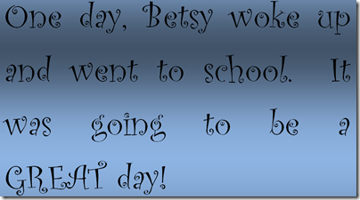
I’m sure you’ve seen children’s stories that look like this. The text is muddled and hard to read:
So how can you rescue your book from falling into the same trap?
Ten free font combos to the rescue!
These 10 winning font combos are superheroes of the modern design world. They’ll help you perk up any kids’ book and create just the right mood for your story. These 20 fonts are all free, so there's no excuse to stick with Calibri, Times New Roman, Papyrus or (gasp!) Comic Sans anymore.
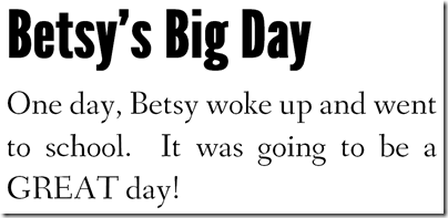
1. Droid Serif (body) with ChunkFive (titles)
I’ve used this lots of times, because it’s great for everything from nonfiction to short picture books. It is clear and easy to read but there’s an element of fun here nonetheless. (Thanks to Cameron Chapman for this pairing.)
2. Alegreya (body) with Yeseva One (titles)
Yeseva One is one of those fonts you see all over the place but don’t really notice because it’s a trickster. At first glance, it’s totally traditional, and then you notice those curves, like the little flick at the base of the Y. And Alegreya is one of those tried-and-true classics that will go with anything. (Thanks to Joel Friedlander for the idea for this pairing; use it in his ready-made kids’ book templates here.)
3. Crimson (body) with Mountains of Christmas (titles)
This Mountains of Christmas font reminds me of a Roald Dahl book, and for good reason. The letters are playful and fun, without sacrificing readability. Crimson is a terrific standby, a modest font whose very traditional rounded curves make a great pairing with any more avant-garde font. (Thanks to Joel Friedlander for the idea for this pairing; use it in his ready-made kids’ book templates here.)
4. Leander (body) with Permian Slab (titles)
I love crackly, falling-apart looking fonts. But you have to be careful with them, because some can be very unclear. I love the way this Permian Slab font is matched up with a body font that is extra-clean and careful, with strong, bold lines, without being overwhelming. (Thanks to Joel Friedlander for the idea for this pairing; use it in his ready-made kids’ book templates here.)
5. Josefin Sans (body) with Dancing Script (titles)
This is actually a slightly riskier, more feminine pairing, probably the most adventurous of all the pairings shown here. Try it and see… you can always substitute a more standard serif font for the sans-serif Josefin Sans if you don’t like the overall effect.
6. Book Antiqua (body) with Idolwild (titles)
Everything about this combination says kids, adventure, fun. Even with a lousy story excerpt like this one, I’m totally eager to find out what happens next. If you use a Windows-based computer, you probably already have Book Antiqua on your computer. Idolwild is one of those great standbys to have around anytime.
- http://fontsgeek.com/fonts/download/Book-Antiqua-Regular.zip
- http://www.fontsquirrel.com/fonts/Idolwild
7. Garamond (body) with Aquiline Two (titles)
To me, the Aquiline font says pirates, boys, and great big dreams. But unlike many pirate-style fonts, which can be very muddled, it’s still readable and clear. You’ll always want to couple a complex title font with something pristinely simple like this classic Garamond font. (Thanks to Nathaniel Dodson for this pairing.)
8. Fanwood (body) with League Gothic (titles)
Maybe it’s the name “league,” but something tells me these are a great combination for a sports story. The big bold lettering opens the story in a promising way, while the body text is very traditional and super-clear.
9. Bell MT (body) with Novocento Wide (titles)
- Hmm… out of all these fonts, I don’t remember where Bell MT came from. It may have been included with one of my previous Windows versions (I take all my fonts with me from computer to computer), in which case you might have it already. If not, there are many similar fonts out there, including Cardo, which you can get here: http://www.fontsquirrel.com/fonts/Cardo
- http://www.fontsquirrel.com/fonts/novecento-wide
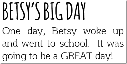
10. Afta Serif (body) with Amatic (titles)
To me, this combination is simply delicious. The letters are playful and fun, with little flairs like the curve of the “k”, but they are also very spare and simple to read. With so much white space, reading this story will be totally easy on the eyes.
A professional’s opinion
Since my husband is a graphic designer, and he was just sitting around, I asked him which of these were his favourites. He said it would depend on what kind of story it was, but #5 and #6 were his favourites. He said number six is more formal-looking, while five is more fun and casual.
Go ahead and play
I admit it – I’m a font junkie. But you don’t have to be. With a few good basic fonts under your belt, you’ll be all ready to create books that look professional and read like a dream.
Download some of the fonts here and try them out on your story. Any of the combinations you see here are “safe.” They’ll give you a book that’s readable and clean-looking. You’ll get titles that stand out without assaulting the reader, and text that flows without interruptions or messy breaks.
But you can also mix and match the titles and bodies and maybe come up with some dynamic combos all your own.
… But play safely
If you decide to download other fonts, be careful! Not all fonts and font sites are created equal. Only download fonts from reputable sites like FontSquirrel. Most fonts download to your computer as a ZIP file, and then you have to unzip and install them before you can start using them.
There are also copyright issues involved in fonts. Though we don’t think of them that way, fonts are actually original artwork. Many are free to use commercially (ie in your books), but some are not.
Free fonts can have other problems as well, and you should stick with the most popular ones, like those shown here, rather than experimenting. This post from Joel Friedlander (The Book Designer) is also well worth reading to find out what the possible pitfalls are of choosing free fonts.
But don’t be afraid to play around with the fonts you’ve got. I’m sure you’ll come up with a winning combination that’ll bring your story to life in a new and exciting way.
I’d love to see what you come up with – and what you’ve already used in your books. If you have a favourite font pairing for your kids’ books, let me know in the comments or email me.


0 comments:
Post a Comment
As always, I love to hear from you.