Covers are hard. If you’re like most people, I hope you don’t even try to do them yourself. But even if you hire a pro, it’s easy to wander off the path of good judgment into the jungle of horrific, embarrassing covers.
That’s why we need objective feedback.
Which is where Joel Friedlander, the Book Designer, comes in. Every month, he hosts a cover contest. It’s free to enter, and if you have a cover you love, you really should. It won’t boost book sales directly, but it’s worth it, I promise.
Remember: every single buyer is judging your book by its cover. You can’t escape from that simple fact.
Every month, Joel shows off every cover he gets. Sometimes he adds praise – but sometimes, his comments can sting. One author proudly submitted his cover with the words “Fully designed by the author himself.” To which Joel replied, “That’s apparent.” About another cover, he wrote, “Impossible to tell what was intended here, but clearly this is a disaster.” (My personal favourite: “Pretty much announces: “I’m self-published!” And not in a good way.”)
I have to laugh – even when his criticisms are aimed at me, which they have been a couple of times. Don’t submit anything unless you’re prepared for him to tear it apart.
Most of the covers he gets are for adult books. Why not more kidlit? Maybe because most of us aren’t putting enough money/effort into our covers, and aren’t proud enough of the results.
That’s REALLY got to change. I hope this list inspires you to create excellent covers that will hog all the top spots for 2015.
Here (in no particular order) is my personal Top Nineteen of all the kids’ covers that he’s featured in 2014. NOTE: I haven’t read the books. I’m literally just judging them by their covers.
Down below, you’ll find 10 “misses” and “near-misses” that failed on one count or another to make it to that empty #20 spot in my “top” list. Plus two grownup books with really, REALLY bad covers that make me wonder why anyone would submit them to a contest. And one I loved that inspired me to buy the book.
#1
The Boy Who Loved Fire by Julie Musil. There were many great YA covers this year; I think authors in this category are a lot more serious about their covers than if they’re just writing “kiddie books.” (Again, that’s really got to change.) Joel didn’t say anything when it was listed in January, but in March when he listed it again, he said, “Although a bit overwrought, it is nicely creepy.”
#2
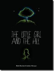
The Little Girl and the Hill by Brett Henley. In January, Joel didn’t like the smallness of the text and I agree – you can’t read the author’s name, even with this fairly large thumbnail. He said the art was lovely but that the cover overall is “a dark and easily skipped muddle.” Still, something about this concept really appeals to me. Like finding a good black t-shirt for a baby, it’s rare to see an all-black cover on a kids’ book. (Caveat: the interior looks similarly all-black, and I’m not 100% sure how good that would look on an ereader.) I do wish they’d re-do the fonts, however.
#3
Welfy Q. Deederhoth: Meat Purveyor, World Savior by Eric Laster. Like Joel said when this appeared on the August list, there are many little elements that make it hard “to really make sense of it at a glance.” But he also said it has “Cool typography and an illustration style that matches perfectly,” and I completely agree. The subtitle should be bigger and bolder because that alone makes me want to pick up this novel “for kids 9 and up.”
#4
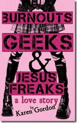
Burnouts Geeks and Jesus Freaks: A Love Story, by Karen Gordon. I almost didn’t pick this one because it didn’t scream YA or kids, but it really is a YA novel, so I guess it qualifies. There’s so much attitude going on here on this cover that it made me a little uncomfortable, but I’m guessing that’s the point. It’ll probably really appeal to a YA audience. Joel gave it one of his special gold stars in May and said, “Very cool and just right.”
#5
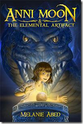
Anni Moon & the Elemental Artifact by Melanie Abed. This totally pro cover (despite the designer having the same last name as the author!) suggests a slightly younger but nonetheless Harry-Potter-style kids’ magical adventure book series. In October, Joel said, “I love the drama in this cover, and the way lighting has been used to heighten the overall effect. It’s perfectly positioned for its target audience, too. Nice job.”
#6
Immortal Chaos: Who Let the Gods Out? by Mary Evans. I had to pick this one, because it’s so highly reminiscent of the Quentin Blake covers for Roald Dahl’s books (crossed, maybe, with the Time Warp Trio?). Happily for its author, I’m sure lots of kids will, too. In May, Joel called it, “Sweet and amusing with an obvious appeal.”
#7
Elijah and the Priests of Baal by Jennifer Tzivia MacLeod. The only one of my covers that I’ll include here, I really, really love this one. In September, Joel agreed, saying, “Great, idiosyncratic illustration style, you ended up with a winner.” He didn’t love the other 2 I submitted that month, or the ones I’ve submitted since. Can’t win ‘em all, but I’m trying!
#8
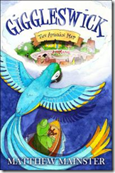
Giggleswick by Matthew Mainster. I love the combination of a really striking image and an interesting title. In August, Joel did point out that the subtitle is too tiny. I kind of agree, but with art this good, it definitely overcomes the self-published stink.
#9
Time Square: The Shift by S.W. Lothian. I like this cover a lot, but I don’t love it. I think that’s because of the weird and clashing font used for the author’s name at the bottom. Maybe that’s what Joel was talking about when it appeared on the April list, saying, “It’s bright and fun, wish some of the type was easier to read.”
#10
Numinous by Emory Skwara. I’m not even sure this is a teen/YA book, but the illustration on the cover certainly suggests it is. Joel didn’t find fault with the typography (lettering) when he mentioned it in October, saying, “An intriguing piece of art and title treatment that really complements it well. The way the designer has limited the color range helps, too.” But although I like the loopy font, I actually thought it said “Numingus” at first.
#11
Ice Trekker by Pamela Kelt. In January, Joel said, “Nice cover, would have liked the title to stand out a bit more.” I think the title works. It’s okay, even if it’s not fabulous. But the art really makes this cover; head and shoulders above lots of what I’ve seen on other indie books.
#12
Ich, Bakoo (I, Bakoo) by Hubert Wiest. I love this cover! This is dystopic middle-grade scifi. I like the monotone palette here, as well as the typical “kid-looking” kid in the middle of this weird dystopic scifi world. In May, Joel called it “Simple and effective” and I totally agree.
#13
The Fantabulous Fens by Gautam Sen. Slightly on the amateur side, but I like its cheerful splash of colour. Featured in October, I don’t know much about this book except it looks like a ton of wacky fun. Joel said as much, too: “It definitely says “fun!””
#14
The Dragon Box by Katie W. Stewart. I love this cover, period. Joel, in July, called it “Appealing,” but I think it’s absolutely fantastic; a very professional-looking cover. Doubt a mainstream publisher could have done much better within these parameters: the dragon, the box, the setting, the mood. I’d definitely buy this book if I had a kid into dragons.
#15
Judah the Barracuda by Narie Gibson. From October’s list where, Joel calls it “Amusing and ferocious at the same time.” I personally don’t love how blurry the author and illustrator names are at the bottom. Perhaps a black outline, a little sharper, would have helped with this. I wouldn’t have put it on my “winners” list except I realize that my opinion isn’t everything, and if Joel likes it, this design must work for some people.
#16
My friend Suhanna: A story of friendship and cerebral palsy by Shaila and Aanyah Abdullah. In January, Joel said, “An absolutely delightful illustration that just needs a little more attention paid to the title typography to really shine.” Like Joel, I adore this illustration. It’s so sweet! The font seems okay to me, but Joel really knows his stuff, so if I were this author, I might want to redesign with more appropriate fonts.
#17
Meet Bacteria! by Rebecca Bielawski. I love how retro this cover looks. On October’s list, Joel didn’t like the drawing of the microscope, but to me, that’s part of the charm. I love science for very young kids, and the illustrations have a lovely, handmade feel to them. Whoever wrote the text for the book’s description on Amazon could take a lesson from the book’s spare rhyming verses, as it’s way overblown and includes a few errors. A second cover in this series, Bees Like Flowers, appeared in November, and it’s even more appealing.
UPDATE: I’m absolutely thrilled to announce that Meet Bacteria! also clocked in as one of 2014’s ten Gittle List winners for self-published kids’ books. Way to go, Rebecca!
#18
Numb by Tanya Paterson. Another YA title, because I think YA writers know they need to appeal to a more sophisticated reader. I find this cover utterly intriguing and magnetic, nearly flawless. It certainly doesn’t stand out as “indie” in any way. Joel wrote, on the May list, “Once again the designer [Damon Za] is in complete control, making the cover of this YA novel attractive for all the right reasons.”
#19
Up, Back & Away by K. Velk. Best for last! This cover is absolutely delicious in every way. It won the fiction award for October and Joel wrote, “Everything you want in a book cover. Fantastic illustration that virtually propels us into the story, and distinctive design and typography that can’t be mistaken for any other book. Lovely.” Doesn’t this picture and its framing just suck you into the story and make you want to find out what happens? (Hint: the author insisted that the cover designer actually READ the book first!)
These were a few near-misses over the year that I wanted to highlight as well. These are covers that came close, but failed to gain Joel’s wholehearted approval – and mine.
Near Miss #1
In January’s list, Joel said “needs a stronger title,” and I agree. This off-the-shelf that isn’t strong enough against the bright colours of the illustration. Plus, I hate seeing awards slapped on kids’-book covers, unless they’re a Newberry or something real.
Near Miss #2
This one appeared on the March list, and Joel didn’t comment, but I will. I love the title! I love the image! The background is a little simple, but so be it. But this book and its cover lose me after that. The subtitle, “A Book about Bullying” needs to go. If I was a kid, that would sound too much like “take your medicine,” and I’d throw it away. Another downer: the “Ed. D.” at the end of the author’s name. Her degrees might qualify her to write adult nonfiction about bullying, but if this book is aimed at kids then she should drop it from the cover and maybe mention it somewhere else, like on the back cover or bio.
If you’ve written a great story, it doesn’t matter how many degrees you have. And if you haven’t, it doesn’t matter how many degrees you have.
Near Miss #3
Joel liked this one when it appeared in May, but I don’t. I think the cover dimensions are weird (and will show up very badly in the Kindle store and the author page). I’m not sure why this cover needs a border/frame, what the blue thing is at the top of the frame, and why Russell needs a rabbit with him when he rides the range. I don’t particularly love the illustration style, either, so if that’s what’s inside the book, I’m not buying it. (But that’s just me; others may love the style.) EDITED TO ADD: I notice that the dimensions have been changed to a more standard size now on Amazon.
Near Miss #4
Okay, this one isn’t really a near miss. It’s a far miss, like way out of the ballpark.
I absolutely love the idea of this book and the way it could open up a whole new world of diversity to readers (see My Friend Suhana, #16 above!). But the pictures look like they’re hand-drawn by a teenager, and the “design” of this cover is basically some words slapped onto the picture.
The excess capitalization of words on the cover tells me the interior could probably use a good edit, too. In response to the author’s brag that it was the artist’s first cover, in October, Joel said, “Yes, that’s readily apparent. I’m sorry to say this is a very amateurish attempt.” Like I said, don’t submit your book to him if you’re at all sensitive about what he might say.
Near Miss #5
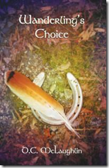
On June’s list, guest judge Cathi Stevenson said “The title treatment is weak. I’d make it much larger and perhaps overlap the design elements a bit with the title, so it all comes together.” I agree. This font is a cliche, and not a good one, for YA fantasy. I also don’t “get” the feather and the horseshoe. Even though I understand that those are elements in the novel, I don’t like when a cover feels like an “in joke.”
Near Miss #6
Another one Joel liked that I didn’t so much. In October, he called it “Charming and apropos.” I love the illustration, but hate the words “Life Lesson – Bullying” right underneath. If kids want life lessons, they’ll sign up for them. When they pick up a book, it should usually be for pure pleasure.
Near Miss #7
This one, from the July list, comes SOOOooo close. I love this image! The art is great, but the subtitle feels amateurish, stuck on in a very generic font, like Arial. It should probably be in all one line under the title, but then, I’m not a pro. Joel calls this cover cute and well-targeted at its readership, but says, “I don’t think I would compress that title type so severely, though.”
Near Miss #8
On the November list, Joel says it’s “Kind of adorable, really, although the girl’s face could be more prominent,” but I’m a little grumpier. It feels amateurish to me. The title is all mixed up in the splashy lines coming out of the gem and I don’t like the style of the illustrations. The author and illustrator names are completely obliterated by the splashy lines, shoved right to the edge like an afterthought. Feel free to disagree with me.
Near Miss #9
Just yuck. Another one that isn’t really a near miss, just pure yuck. Joel’s comments in October sum up the whole gruesome enterprise when he says “thank you for educating our youth on this important topic. However, the cover is a disaster and looks more like a page from the book than a book cover. It’s difficult to read, hard to make out what’s going on, and it’s bleeding onto the page. Hire a pro.”
Near Miss #10
The truth is, this is a great illustration – love the dung! – but the author has taken the illustration, slapped on some words and pretended it’s a cover. It’s not. (I’ve learned this the hard way with my own books.) In July, Joel said, “This charming illustration could have used typography that doesn’t look like it’s from a corporate report.” Yeah, that.
Worst cover spotted
There were many, many bad covers to choose from, but this one totally made me laugh out loud. It looks like a mix of the premade Amazon covers along with some weird photoshop cutting and pasting. Joel’s comment, from May was uncharacteristically understated when he said, “Needs lots of help.” UPDATE: I see that there is a new cover for this book on Amazon. Only slightly better.
This one, from November, came in a very close second.
…And the one indie (grownup) book that totally hooked me
The Last Seven Pages by James Pinnick. Out of all the hundreds of book covers I looked at gathering the kiddie books for this post, this is the one adult book that totally snagged my imagination and wouldn’t let go. Joel said, in May, “Another great example of a cover that expresses the essence of the book, here with a quiet simplicity.” I quite agree. Not the best cover of the year, but a book I definitely want to read.
Which of these book covers do you love? Which do you hate? Has this list made you think twice about how to go about designing your own covers? (Or handing the job over to a professional?)
Tell me all about it in the comments! (If you’re one of the authors featured, I’d love to hear from you as well.)
p.s. I loved rounding these up SOOooo much, I’m thinking about doing it again for 2015! Let me know if you’d like another cover roundup next December. I'm doing it again in 2015! Click for all the details.











Jennifer,
ReplyDeleteWhat a great idea for a post, and the way you've done it is both educational and entertaining. It's a bit odd for me to re-read some of my comments here, but I enjoyed it thoroughly. Thanks!
Thanks for stopping by! I believe it's terrifically instructional (required reading, in fact, for anyone who hopes to publish), but I've tried to make it fun as well.
DeleteThanks for your kind comments here and on my blog. (How could I quibble with "best for last"). Covers are, of course, the curb appeal and essential for getting people through the door. I get that (now). Of course the book then needs to deliver on its promises... I'll pass a link to your post on to my wonderful collaborator, the artist Juan Wijngaard.
ReplyDeleteAbsolutely! That goes without saying, and I did point out up above that I haven't read any of the books listed. However, no matter how great your book is, nothing's going to happen if you can't get readers in the front door. Terribly sad, but true. Thank you for stopping by!
DeleteI enjoyed looking at these, though I disagreed on some. I LIKE plain fonts.
ReplyDeleteFlora: I promise, so do I. In fact, many of these covers are fairly simple, in terms of typography. And I rejected some of the more elaborate entries; at some point, they get really hard to read. But sometimes plain is TOO plain, like if you use standard system fonts, like Arial.
DeleteHi Jennifer,
ReplyDeleteThanks for including my cover. It's the second one I've done for this book. Now I just have to do some illustrations for it, so that I can get it into print. (Katie Stewart)
I actually came across the first and agree with your decision to go with this one. The illustration is the same but the mood and background are so much more intense with this one. Thanks for stopping by!
DeleteRebecca, as discussed via pm, it's nothing a quick trip to your Amazon Author Page can't fix. :-)
ReplyDeleteAs the Editor-in-Chief of Middle Shelf Magazine, I receive many indie published kids books for review each month. My biggest complaint, and the #1 reason why I pass on most of them is poor cover design. Having a professionally designed, appealing cover is a MUST! Sadly, too many self published kidlit authors are willing to pour their heart and soul into their stories, but then skimp on the cover. In my opinion, the two places where every indie author needs to invest both time and money is in cover art and a professional editor. It will be worth it in the end.
ReplyDeleteSo true Laurisa. If anything is worth doing, it worth doing right.
DeleteLaurisa, I appreciate your stopping by to share your perspective. I hear from lots of authors who are mystified about why their carefully-crafted book isn't selling or (as you've said) being accepted for review.
DeleteBy opening up the 2015 indie kids' book covers contest to writers directly, I hope to keep calling attention to this and hopefully inspiring them (us!) do go the distance - springing to the finish line with a fabulous cover.
I especially like #10 Numinous. Simple yet intriguing. That's what I'm hoping to achieve with my book cover which is currently a work in progress.
ReplyDeleteThanks for the insight! Was fun!!
Jeanne - I do love that one. It totally popped out at me. However, I still have my concerns about the typography. The font is striking, but doesn't it look a bit like "Numingus" to you? Okay, maybe it's just me... :-)
DeleteIf you end up publishing your book before November 30 and love the way the cover turned out, be sure to enter it in the 2015 edition of the indie kids' book cover contest. Can't wait to see it!
Jennifer, your analysis' are constructive and of value to authors. Too bad the worst of them didn't see it coming. I think I was the first to publish a hardcover YA color illustrated novel over 150 pages. "Littluns" is a 411 page epic novel and there's good reason why I stood alone - it's just too expensive to print. I wanted to create a very different reading experience and so I did on many levels, but experts said that I should have charged more, just to brake even. My cover is intentionally simple, intended to draw the reader in. I went from elaborate to finally what it is. I can only imagine what you might say about it, but later did a different eBook cover in which only time will tell if that makes any difference.
ReplyDeleteHindsight is always 20/20 in everything out there. To stand out from the crowd we all need to spend all the time it takes to produce a complete, quality product that will last the test of time. Otherwise, what would be the point.
I totally agree with you that simplicity should usually win out... and that there isn't much point to releasing a book if the cover doesn't do the job it is supposed to. Thanks for stopping by!.
Delete