Monday, March 30, 2015

Illustrating your kids’ book on a shoestring budget: YES, you can! (here’s how)

image

Your book is perfect… now, do you know where are the pictures are coming from?

The other day at my SCBWI meeting (have you joined yet?), I mentioned my easy technique for creating a Kindle book from Microsoft Word, and I said, “you just take the words and pictures and pull them together in Microsoft Word.”  To which someone asked, “yeah, but where do the pictures come from???”

Everybody’s ears perked up.  Where DO the pictures come from?

You see, most of us are writers, not illustrators.  Some of us couldn’t even draw stick figures, even if our lives depended on it.

If you write AND draw, you’re lucky.  For most of us, writing is easy… and drawing our own pictures is an impossible dream.

But don’t worry – that doesn’t mean you’re stuck!  Here are three affordable ways (from cheapest to most expensive) that I’ve managed to get great pictures for my own books at prices that didn’t bankrupt me (yet):

1) Super-cheap:  Stock illustrations & photos

I told you a couple of weeks ago about how I get stock photos and illustrations for only $1 apiece… and sometimes, even less.  I really recommend you check it out.

Not every book is the right fit for stock photos, but sometimes, they can add a lot of fun to a story.  I’ve written a series of Jewish holiday children’s books illustrated with stock photos of animals.

Friday, March 27, 2015

Best of the (Kids-Book) Writing Online this week: March 27, 2015

image

An occasional roundup of blogs and other writings for kids’-book writers and illustrators… stuff that’s inspiring me, so I hope you’ll enjoy it, too.

1. Are we turning teens into readers… or turning them off reading?

Over at Writers Rumpus, Marti Johnson asks, ”why is it that our high school age students abandon – no change that to – are driven from reading?”  Does required reading instill great habits, or just make teens resent books? 

I had spent two months of the summer prodding, pleading, arguing, punishing and bullying this 16-year-old into reading a classic that he will now abhor for the remainder of his life. I decided to read it. Well, I hated it too. As a matter of fact, I didn’t finish reading it. IMHO, it was AWFUL.

Read more from Writers Rumpus in How to Build Better Readers: IMHO

2.  Want to write a book with “Happy Birthday” in it?

Or any other song, for that matter?  Chances are, you will write a book someday that has lyrics in it.  Do you know how to do it without getting yourself sued?  Helen Sedwick explains that it’s not as tough as you might think.  She also lays out some great alternatives if you don’t want to pay.

Saturday, March 21, 2015

Beyond ABC and 123: 5 easy themes you can use to write picture books.

image

Do you love the light in the tiniest kids' eyes when they listen to a picture book?

"Theme" books, like ABC's and 123's are time-tested favourites for a reason.  The very youngest readers (and listeners) love seeing familiar patterns and concepts - numbers, letters, colours, shapes, sizes.  What would be deathly dull for us, as adults, is absolutely the hottest thing with little kids.

Lots of writers make the mistake of trying to mix things up for very young readers.  You have to keep them entertained, right?

Wrong.  Instead, make your life easier and try one of these five familiar themes.

Of course, if you want to sell parents on your idea, you'll still have to make it original to some degree.  But remember that it doesn't have to be all that original to charm buyers and knock little kids' socks off. 

A lesson about kids – from Malcolm Gladwell

image Malcolm Gladwell showed in his fantastic book, The Tipping Point, that when little kids had a choice, they would watch the EXACT SAME episode of the TV show Blue’s Clues every day for an entire week. 

Even the show’s creators were shocked. 

Not only were kids NOT bored, they were more excited and engaged every single time they saw the episode.

Thursday, March 19, 2015

Are you racist – and you don’t even know it? 3 easy ways to fix it.

image

You know you’re not racist.  But do your readers know it?

Check your writing for signs of these 3 mistakes.  They’re probably there unintentionally, but rest assured that readers will find them – and take it personally, even if you didn’t mean any harm.

Be prepared to root out these problems wherever you find them.  Let’s try to create books that accurately reflect children’s reality, regardless of their skin colour or socioeconomic status.

Only one, or Tokenism

I’m sure you’ve seen this one before:  all the characters in a story are white… except one.  You can see the one black, or Asian, or East Indian, character hanging out in all the illustrations.  Maybe it’s one character in a wheelchair, or a girl in a hijab.  Or one character with some other type of difference, whatever it may be.

Yes, diversity is important.  But that doesn’t mean throwing in a single character of a particular “type,” simply to serve the goal of diversity.

QUICK FIX:

Monday, March 9, 2015

How to illustrate a children’s book for $1 a picture or less.

image

The best price tag of all is free.  I’ve written before about finding and using free photos to create gorgeous children’s picture books.  (Don’t believe the haters; it really is possible.)

But what if you can’t find what you’re looking for at the free sites?

Stock photo sites can charge hundreds of dollars for a membership.  What a hassle, am I right?  That’s no problem if I’m The Huffington Post or some other big corporate website. 

But for little guys like us, it’s more than we’re likely to make back from all but the most successful kids’ books.  I really hope you will be that successful, but wouldn’t it be nice to keep that money in your pocket instead?

A stock image resource for the little guys

That’s why I want to tell you about a site I’ve been using for a while now that I absolutely love.  I think you’ll love it too.  Once you hear the name, you’ll understand what it’s about, start to finish. 

Ready…?  Okay.

It’s called Dollar Photo Club.

Why is it called that?  Um, because all the photos and images there are $1 each.  Totally simple, right?

It works with a monthly membership, so you get a certain number of “credits” each month; they roll over if I don’t use them.

Even though it’s called Dollar Photo Club, they have way more than just photos.

What can you find there?

There are lots of hand-drawn illustrations, ranging from cartoons to sketches and more.  You can even click on the name of an artist to find more in the same style. 

Sunday, March 8, 2015

Stuck for starters? Viral story starters from 3 kids’ best-sellers.

image

How should you start your story?  Every children’s book editor and agent will tell you:  the action needs to begin on Page One.

But hey, isn’t that a little unfair?  What if you have a great idea, but you need to take a few pages to get to it?  Shouldn’t the reader be patient and bear with you? 

The cold hard truth is that today’s readers won’t, and neither will today’s book-buying parents and grandparents.  Your story has to hook us on Page One if you want anyone to invest their time and read any further.

What does that mean for today’s writer (that means you)?  It means starting your story in the middle of the action.  (In Latin, if you want to get fancy, that’s called in media res.)

Let’s see how some of today’s hottest-selling kids’ books do it.  Take a peek at what’s flying off the virtual shelves at Amazon:

Viral Bestseller #1:  The Day the Crayons Quit

The Day the Crayons Quit, by Drew Daywalt Take a look at the current bestseller The Day the Crayons Quit, by Drew Daywalt, illustrated by Oliver Jeffers.  How does it start?

“One day in class, Duncan went to take out his crayons and found a stack of letters with his name on them.”

Monday, March 2, 2015

Is your kids’ book blah or blechhhh? These 10 FREE font pairings add a professional touch.

image

Picture a mom, surfing Amazon one morning.  Maybe she’ll buy your picture book?  It’s perfect for her kids.  The cover sure looks promising, she thinks.  She clicks on it to Look Inside.  She skips through a couple of pages, and suddenly, she’s shaking her head. 

Something’s clued her in.  She’s figured out that your book is self-published and she suddenly has no desire to read any further.

What went wrong???

Readers don’t usually know exactly what’s turned them off about a self-published book.  But a lot of the time, badly-chosen fonts are the culprit.  Maybe your fonts are amateurish?  Maybe you’re using cruddy novelty fonts that make your book hard to read or dizzying on the page?

Today, there are so many great great FREE font choices out there.  Your book doesn’t have to be the one she clicks shut.  It could be the one she clicks Buy for instead and eagerly waits for it to show up in her mailbox so she can share it with her kids.

You may not be a professional graphic designer, but you should have some understanding of the basics of what makes a good font combination.  The fonts of your book should be:

  • clear
  • readable (for adults and kids)
  • normal, ie not attract TOO much attention

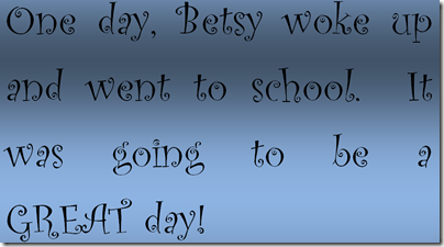
I’m sure you’ve seen children’s stories that look like this.  The text is muddled and hard to read:

image

So how can you rescue your book from falling into the same trap?

Ten free font combos to the rescue!

These 10 winning font combos are superheroes of the modern design world.  They’ll help you perk up any kids’ book and create just the right mood for your story.  These 20 fonts are all free, so there's no excuse to stick with Calibri, Times New Roman, Papyrus or (gasp!) Comic Sans anymore.