Covers are hard. If you’re like most people, I hope you don’t even try to do them yourself. But even if you hire a pro, it’s easy to wander off the path of good judgment into the jungle of horrific, embarrassing covers.
That’s why we need objective feedback.
Which is where Joel Friedlander, the Book Designer, comes in. Every month, he hosts a cover contest. It’s free to enter, and if you have a cover you love, you really should. It won’t boost book sales directly, but it’s worth it, I promise.
Remember: every single buyer is judging your book by its cover. You can’t escape from that simple fact.
Every month, Joel shows off every cover he gets. Sometimes he adds praise – but sometimes, his comments can sting. One author proudly submitted his cover with the words “Fully designed by the author himself.” To which Joel replied, “That’s apparent.” About another cover, he wrote, “Impossible to tell what was intended here, but clearly this is a disaster.” (My personal favourite: “Pretty much announces: “I’m self-published!” And not in a good way.”)
I have to laugh – even when his criticisms are aimed at me, which they have been a couple of times. Don’t submit anything unless you’re prepared for him to tear it apart.
Most of the covers he gets are for adult books. Why not more kidlit? Maybe because most of us aren’t putting enough money/effort into our covers, and aren’t proud enough of the results.
That’s REALLY got to change. I hope this list inspires you to create excellent covers that will hog all the top spots for 2015.
Here (in no particular order) is my personal Top Nineteen of all the kids’ covers that he’s featured in 2014. NOTE: I haven’t read the books. I’m literally just judging them by their covers.
Down below, you’ll find 10 “misses” and “near-misses” that failed on one count or another to make it to that empty #20 spot in my “top” list. Plus two grownup books with really, REALLY bad covers that make me wonder why anyone would submit them to a contest. And one I loved that inspired me to buy the book.
#1
The Boy Who Loved Fire by Julie Musil. There were many great YA covers this year; I think authors in this category are a lot more serious about their covers than if they’re just writing “kiddie books.” (Again, that’s really got to change.) Joel didn’t say anything when it was listed in January, but in March when he listed it again, he said, “Although a bit overwrought, it is nicely creepy.”
#2
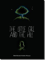
The Little Girl and the Hill by Brett Henley. In January, Joel didn’t like the smallness of the text and I agree – you can’t read the author’s name, even with this fairly large thumbnail. He said the art was lovely but that the cover overall is “a dark and easily skipped muddle.” Still, something about this concept really appeals to me. Like finding a good black t-shirt for a baby, it’s rare to see an all-black cover on a kids’ book. (Caveat: the interior looks similarly all-black, and I’m not 100% sure how good that would look on an ereader.) I do wish they’d re-do the fonts, however.


